


Paint colors cannot be chosen accurately from a phone screen or a one inch chip. The room changes them. Daylight direction, electric light, floor color, upholstery and sheen all affect the result, so a dependable choice comes from a repeatable sampling process.
The Short Answer
Collect fixed finish samples first, identify their undertones, narrow the wall options to three or four, then paint large movable sample boards. View each board on every wall during morning, afternoon and evening before choosing the sheen and quantity.
The examples cover warm and cool neutrals, muted color, deep rooms, accent placement, color drenching and connected open plans. Brand names are references for sampling, not universal answers.
Test Color in the Actual Light
Begin with the surfaces that will stay: flooring, counters, tile, large upholstery and wood. Place the samples together under the room light. A neutral that looks balanced alone may turn pink, green or yellow beside one of those fixed finishes.
Paint at least two coats on boards large enough to read from across the room. Move them between walls rather than painting small squares directly beside one another. Adjacent samples alter perception, and a white border around each board helps separate them.
Check bulbs before blaming the paint. Record color temperature and color rendering information from the package. Use the same lamp settings planned for daily life, then look again after sunset.
Warm Neutral Living Room
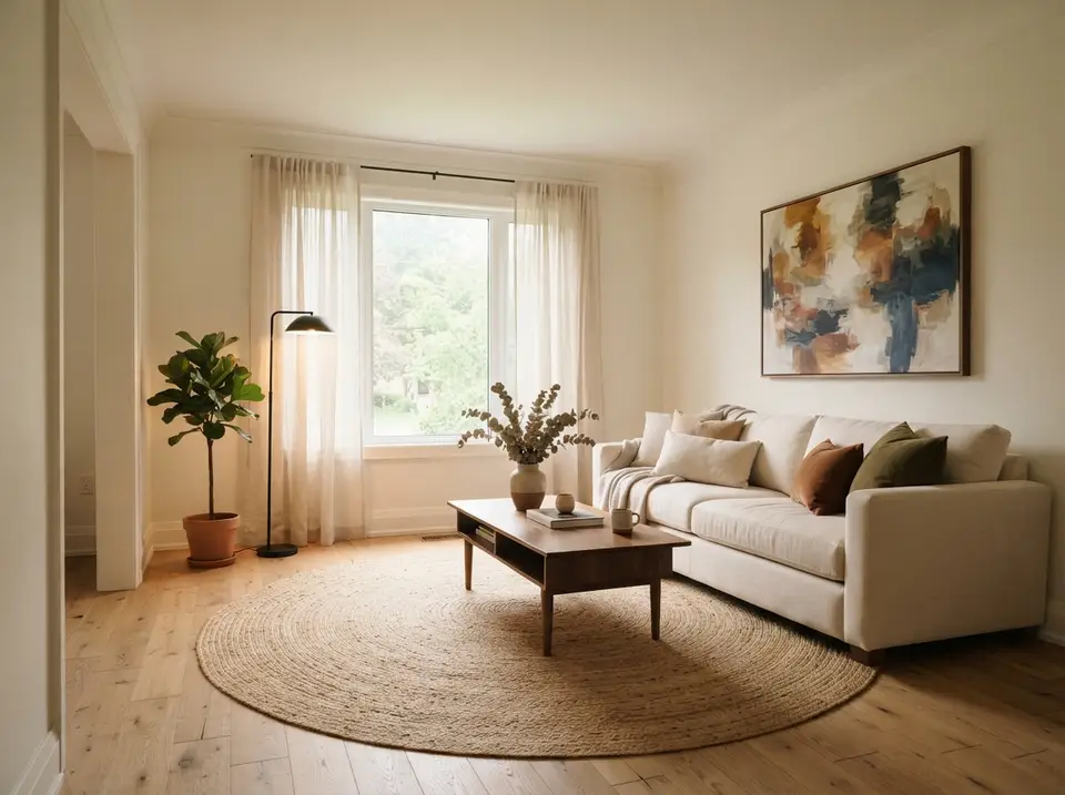
The walls here are a warm off white, close to the cream of the sofa, and they sit over a pale oak floor and a round jute rug. Sheer linen panels filter the daylight, so part of the warmth comes from light bouncing off the wood rather than from the paint itself. Treat the rendering as a decision aid: it shows how much yellow a wall can carry before the floor starts to look orange.
The color succeeds because it answers the floor without turning the room yellow. The rust and olive cushions and the abstract canvas above the sofa supply the stronger notes, which lets the wall stay pale. If your oak has a pinker or redder stain, pull the off white slightly toward grey before committing.
What to Check
Hold the paint sample flat against a floorboard and then against the sofa fabric. The wall should look a shade cleaner than the upholstery, not a match for it, or the sofa will dissolve into the wall behind it. Check once more in the evening with the floor lamp on, since a warm bulb pushes off whites toward yellow.
A Practical Specification
For a room like this, the specification is short: the off white in a flat or matte finish on walls and ceiling, the same color in satin on the trim, and a note of the floor species and stain written beside the paint name. Write down the product line and base, photograph the can label, and keep both with the receipt so a touchup years later comes from the same formula.
Cool Neutral Family Room
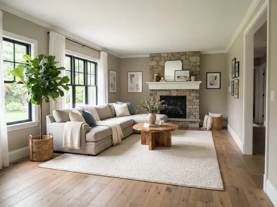
This family room uses a mid greige with a slightly cool cast, chosen against three fixed things: the stacked stone fireplace, the black window frames and the wide oak boards. The stone mixes buff, grey and tan, and the wall borrows from its greyest pieces rather than its warmest ones, which is why the room reads calm instead of beige.
Here the paint belongs to the fixed finishes rather than fighting them. The white mantel and crown give a crisp edge between stone and wall, and the navy cushions on the pale sectional repeat the coolest note in the fireplace.
What to Check
Take the swatch to the fireplace and hold it against several stones in turn. The right color looks as if it were mixed from the mortar and the lighter stones; a wrong one makes the stone look dirty or the wall look pink. Do this with the black window frames in view as well, because heavy dark frames make mid tones read lighter than they do on a chip.
A Practical Specification
Specify the greige in matte or eggshell on the walls, keep the trim and mantel a soft white in satin, and if the stone is sealed, use a matte sealer so it does not pick up a shine the paint cannot match. The rendering shows no overhead fixture, so plan lamps at both ends of the sectional for evenings and judge the wall under them.
Muted Green Bedroom
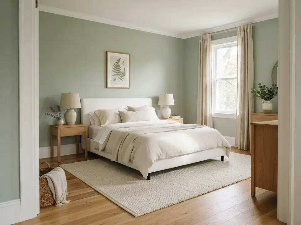
A soft sage covers the walls of this bedroom, with white trim and a white ceiling, while the upholstered bed, linens and rug are all cream or white. The oak nightstands and dresser repeat the honey tone of the floor. What the image demonstrates is low contrast between wall and textile: nothing in the room jumps forward.
Bedrooms can hold more color when saturation stays controlled, and this green is greyed down enough to sit behind the fern print rather than compete with it. A brighter, cleaner green would make the cream bedding look yellow by comparison.
What to Check
Test the green against the actual duvet and curtains, not against a white sheet of paper. Oatmeal or cream linen shifts a sage noticeably, and the pairing you sleep with matters more than the chip. Look again with the bedside lamps on, since that is when a bedroom is mostly seen.
A Practical Specification
A washable matte on the walls and satin on the window and door casings, which take more hand contact, cover most of what a bedroom like this needs. The ceramic bedside lamps carry the evening light, so judge the green under those bulbs before buying full gallons.
Deep Blue Dining Room
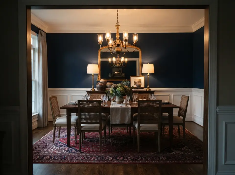
Deep navy fills the upper walls of this dining room, above white raised panel wainscoting and below a white crown and ceiling. The brass chandelier, the gilt mirror and the pair of brass buffet lamps glow against the blue, and the red and navy rug carries the wall color down to the floor.
Dining rooms tolerate darker values because they are mostly used under electric light. The white panelling keeps the lower half bright where the table and chairs sit, so the dark color stays above eye level for anyone seated.
What to Check
Judge a navy like this at night, under the fixture you will actually hang. Dark blues can drift toward black under dim warm light or toward purple under some LEDs, and a sample board propped behind the sideboard shows which way yours goes. Leave a clear walkway around the table once the chairs are pulled out.
A Practical Specification
Deep colors usually need a tinted primer and two full finish coats to reach an even depth, so allow for that in the quantity. Layer the light: the chandelier on a dimmer for general light, the buffet lamps as accents, and enough output over the table to read a recipe card. Eggshell is a sensible sheen here, since flat navy marks easily where hands brush it.
Soft Blue Bathroom
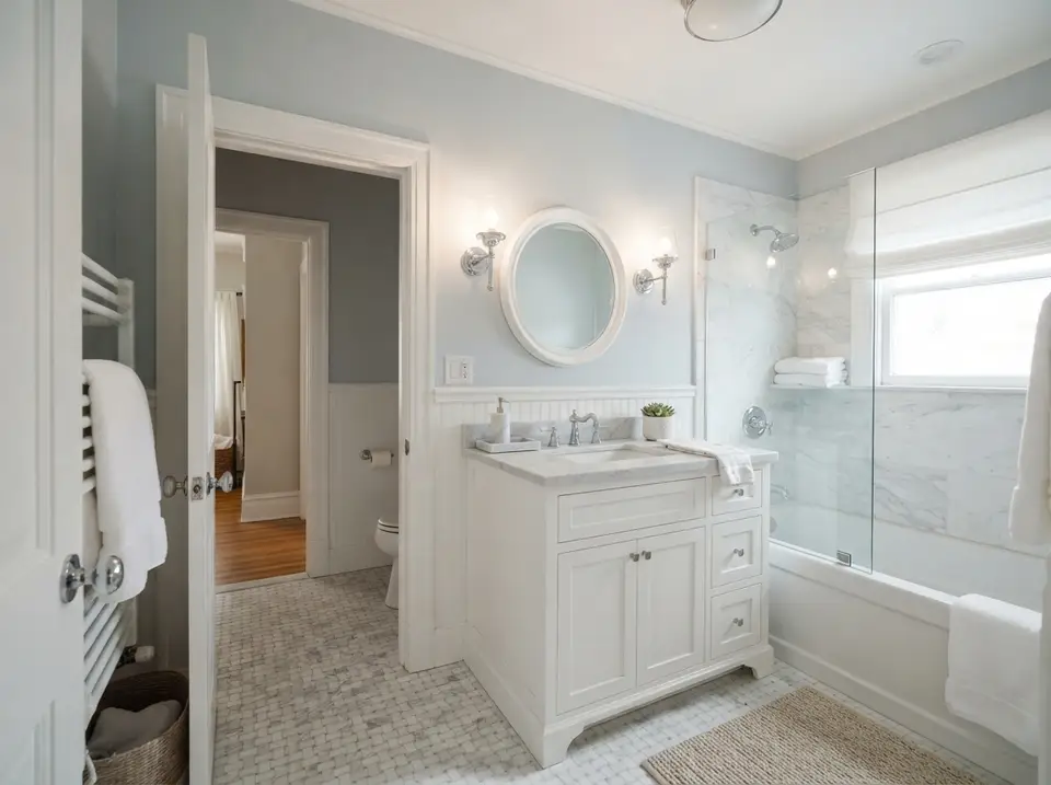
In this bathroom a pale blue grey covers the walls above white beadboard, next to a marble shower surround, a marble topped vanity and a basketweave marble floor. The cool paint keeps the marble and beadboard reading as white rather than cream, and the chrome sconces and taps sit in the same cool family.
Humidity and cleaning make the sheen as important as the hue. Beadboard collects splashes at the sink and the upper wall takes steam from the shower, so both need a finish that can be wiped without going shiny in patches.
What to Check
Hold the sample right against the marble and the painted vanity, both by daylight from the window and under the sconces. If the whites suddenly look yellow beside the blue, the paint is too saturated; if the blue disappears, it is too pale to be worth the change.
A Practical Specification
A moisture resistant satin suits the beadboard and trim, and a bathroom rated matte or eggshell can go on the upper walls when an exhaust fan clears steam quickly. Two sconces at mirror height, as shown, light the face evenly; a single ceiling fixture would leave the blue grey darker in the corners.
Terracotta Accent Wall
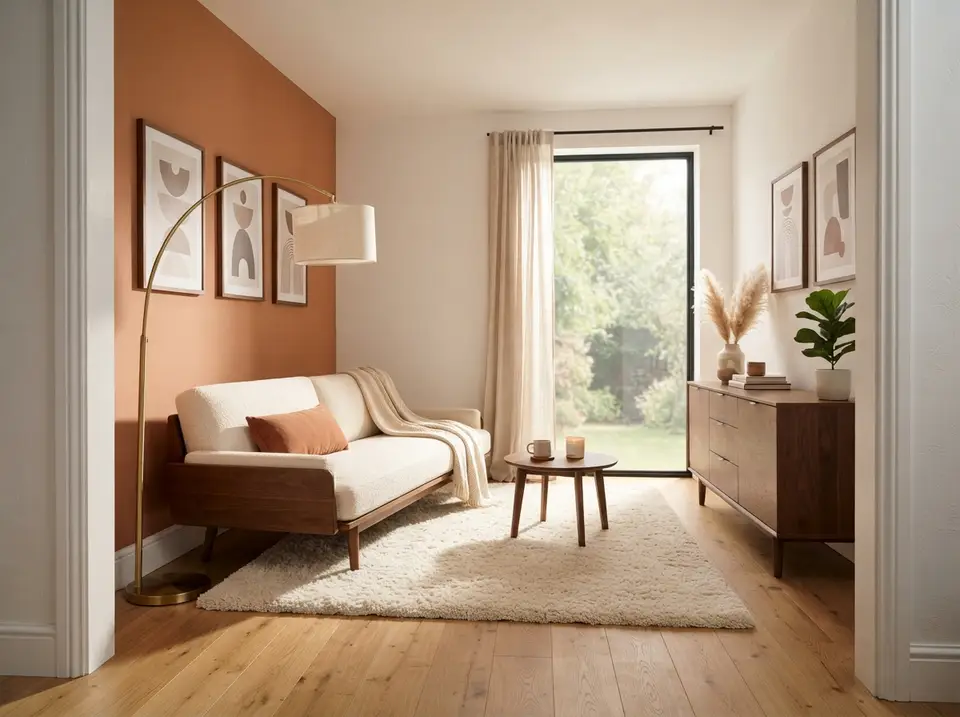
One clay colored wall carries the strongest color in this small sitting room, behind a walnut framed sofa, while the other walls stay a warm white. A terracotta cushion and the earth tones in the three framed prints repeat the clay at a smaller scale, so the wall does not look like an isolated block.
The wall works because it has a clear boundary: it ends at an inside corner, the ceiling and the white baseboard, so the color stops where the architecture stops. Painting half a wall or stopping partway along a run would make the accent look accidental.
What to Check
Pick the plane that already earns attention. Here it is the solid wall behind the sofa, seen first from the doorway; a wall broken up by windows or doors rarely works as an accent. Check the terracotta against the oak floor too, because orange based paints can make honey oak look redder.
A Practical Specification
Clay and terracotta paints often need more coats than a neutral to cover evenly, so buy enough for two coats on the accent plus a test patch. A matte finish keeps the color soft and chalky as shown; something shinier tends to look plasticky in a strong earth tone. The brass arc lamp beside the sofa shows how the color behaves after dark.
Color Drenched Office
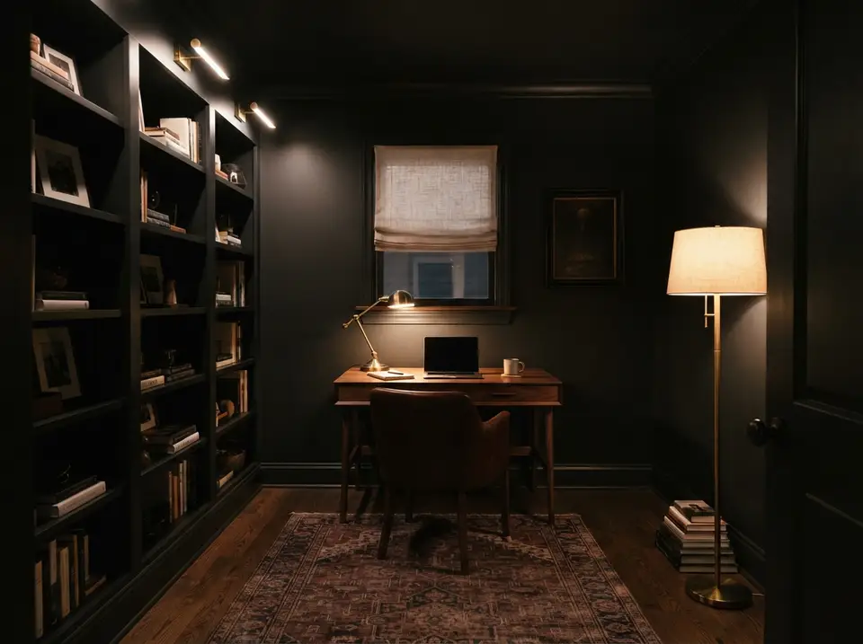
Deep charcoal covers the walls, built in shelving, window casing, door and even the ceiling of this small study. Because no edge is picked out in white, the eye reads the room as one continuous dark envelope, and the walnut desk, leather chair and brass lamps become the lighter objects inside it.
Reducing contrast quiets odd trim lines and awkward corners, which is why drenching suits small rooms with many interruptions. Function then depends on the lighting: the desk lamp, the floor lamp and the picture lights over the shelves each cover a task the dark walls will not help with.
What to Check
Before committing, paint a large board and a short length of trim in the same color and look at them together. The same hue in two sheens reads as two slightly different colors, which some people like and others do not, and that is better settled before the whole room is covered.
A Practical Specification
Specify one color for the whole room and vary the sheen by surface: matte on walls and ceiling, satin or semi gloss on shelving, casings and the door, where hands and books rub. A charcoal this deep will need a grey tinted primer over existing white surfaces, and warm bulbs keep it from going cold and flat in the evening.
North and South Light Comparison
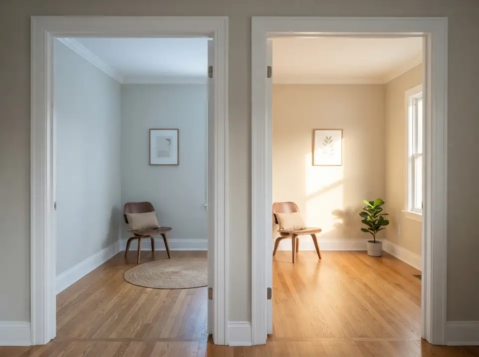
Two doorways open onto rooms painted in the same pale color. The left room, without direct sun, reads as a cool grey with a hint of blue; the right one, lit by a sunny window, reads as warm cream. The matching chairs and oak floors in both rooms make the point that daylight direction is the only thing that changed.
The comparison explains why a sample that succeeded in one room cannot be copied blindly to the next. A whole house scheme has to be checked room by room, even when the paint stays the same.
What to Check
In practice, check the sample in the room it is going into, at the hours that room is used. A shaded bedroom used mainly in the evening and a sunny office used all day may need different members of the same color family, one a step warmer than the other.
A Practical Specification
When one color has to run through several rooms, as it does through these two doorways, a workable approach is to keep the hue and adjust its strength, mixing a slightly lighter or warmer version for the shaded room. Many paint counters can tint a color at a reduced strength, which keeps the family intact without choosing a new name.
Two Tone Dining Room
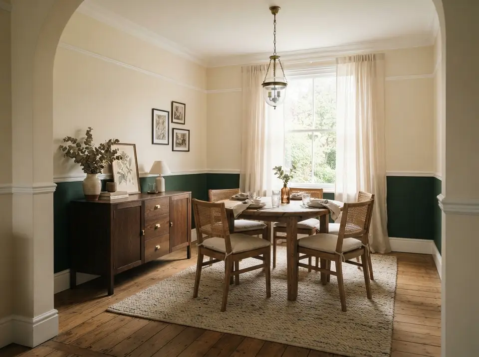
A deep forest green runs below the chair rail in this dining room and a soft cream fills the wall above it, with the rail, baseboard and crown painted white. The arched opening frames the room, and the walnut sideboard sits against the green so its dark wood has something to stand out from.
Two tone paint is strongest when the division already belongs to the room. Here the chair rail sits near the height of the chair backs, so the darker lower band also hides the scuffs chairs leave on a wall.
What to Check
Before painting, check that the rail is level and continuous, since a dark band below it exposes every dip. Then look at where the break meets openings: in this room the rail and the green carry around the arched opening and stop neatly at the window, which keeps the scheme from looking chopped.
A Practical Specification
Use a scrubbable eggshell or satin for the green, where feet and chair backs touch, and a matte for the cream above. The glass lantern pendant throws a soft light over the table, and the pale upper wall bounces it back in a way a fully dark room would not.
Paint Sheen Comparison
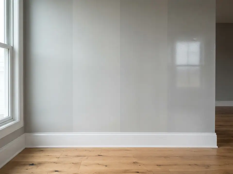
Four vertical bands of the same pale grey run across one wall, from flat at the left to high gloss at the right. The gloss band mirrors the window almost like glass, while the flat band takes the same light without a single highlight.
Higher sheen increases washability and also makes wall flaws more visible. On a wall with patched drywall or old roller marks, the satin and gloss bands would show every repair, while the flat band would hide them.
What to Check
Run the same test on the wall you plan to paint: brush out the shortlisted sheens side by side and view them from an angle, with window light raking across. That side view exposes texture far more than looking at the wall straight on.
A Practical Specification
Touchups are where the sheen choice comes back later. A patch in flat paint blends almost invisibly, while the same patch in gloss shows as a shiny or dull square unless the whole wall is recoated. Note the sheen on the purchase record along with the color name and number.
Open Plan Color Flow
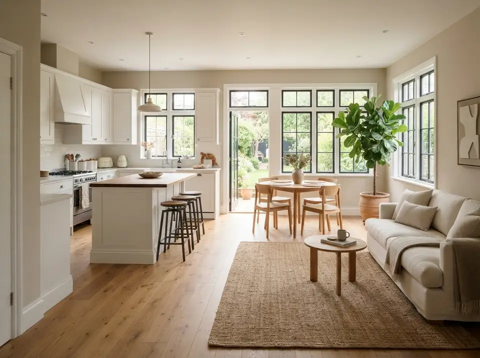
A soft putty neutral covers the walls of this open kitchen, dining and living space, and materials rather than paint define the zones: white cabinetry and a butcher block island in the kitchen, oak chairs around a round table by the garden doors, a jute rug and linen sofa in the sitting area. The black steel framed windows run through all three and tie them together.
Connected rooms need coordinated undertones more than identical accent colors. Here the wall sits between the warm oak floor and the cooler white cabinets, close enough to both that neither looks out of place.
What to Check
Test the candidate on a wall that is visible from every zone, usually the longest run, and look at it from the kitchen, from the table and from the sofa. If it looks right beside the white cabinets but muddy next to the sofa, try a version one step lighter.
A Practical Specification
In an open plan, paint the shared walls one color and save any change for a doorway or an inside corner. Use a scrubbable finish near the range and sink and a matte elsewhere. Pendant, recessed and window light all fall on the same walls here, so view the sample with each of them in play.
Large Sample Patches on the Wall
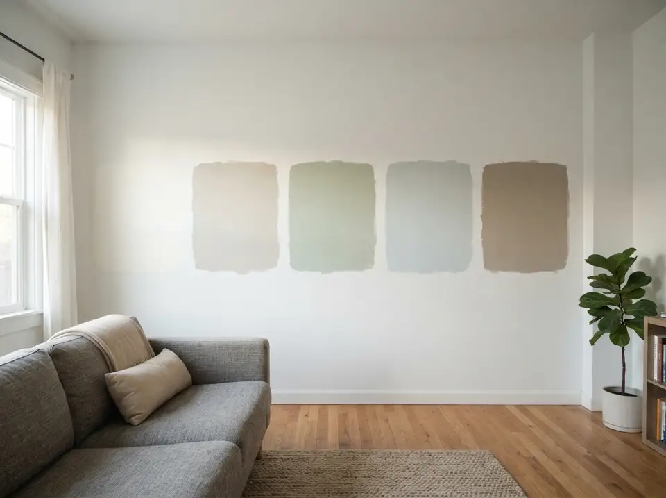
Four broad patches, a pale greige, a sage, a pale blue grey and a taupe, sit in a row on a white wall above a grey sofa. Each is large enough to judge from across the room, and the strips of white wall between them stop one color from tinting the next.
Large samples reduce the false confidence a small chip creates. Painted straight onto the wall as they are here, though, they can only be read in one spot, which is why loose boards that move from wall to wall are the better tool.
What to Check
Stand back across the full width of the room before deciding, then look again at dusk. From a distance the sage and the blue grey in this row can look closer than they do up close, and the taupe may read darker than it did on the card.
A Practical Specification
Once one color wins, buy a small can and paint one more board for the room it is going into before ordering gallons. Write the color name, number and intended sheen on the back of that board so the final order matches what was tested.
Sheen, Quantity and the Final Order
Flat and matte finishes reduce reflection and can hide minor surface variation, but washability depends on the product line. Eggshell is a common living area choice. Satin is often useful on trim, kitchens and baths. High gloss demands careful preparation because every ripple catches light.
Calculate wall area, subtract major openings and follow the product's stated coverage. Deep color, porous repairs and major color changes may need primer or an extra coat. Keep a labeled remainder for touchups, stored according to the manufacturer's temperature guidance.
Paint ceilings before walls, walls before trim and trim before final hardware installation. Protect floors, remove plates rather than painting around them and allow the stated recoat time. Rushing the second coat can pull the first film and change sheen.
For a whole home plan, carry one repeated neutral or trim color through connecting areas. Give enclosed rooms more freedom. The repeated color creates continuity, while doors and thresholds provide natural points for a change.
Questions Readers Ask
How many paint colors should be sampled?
Three or four serious options are enough. Paint two coats on large boards and move them around the room.
Why does paint look different after it dries?
Water or solvent leaves the film, the finish settles and room light changes through the day. Judge the sample only after the stated dry time.
What paint sheen works in a living room?
Eggshell or a washable matte often works. Compare product specific durability because sheen names and performance vary by line.
What sheen works in a bathroom?
A moisture resistant satin or comparable bathroom formula is a common choice. Ventilation and surface preparation remain important.
How does north facing light affect paint?
North light often reads cooler and more diffuse, which can make some greys or whites appear bluer. Test the color on more than one wall.
Should trim always be white?
No. Trim can match the wall, use a related neutral or provide contrast. The decision should support the architecture and nearby fixed finishes.
Can paint samples be trusted on a screen?
No. Screens, cameras and browser settings shift color. Use a physical chip, then test actual paint in the room.
Sources
- Sherwin Williams: color selection and sampling tools.
- Benjamin Moore: interior sheen guidance.
- U.S. Environmental Protection Agency: indoor air information for volatile organic compounds.
- The Home Depot: project calculators and current material categories.
Keep Planning
interior design style guide, living room decor budgets, bedroom decor budgets.

Styling & Living Desk
The Layered Homes editorial teamThe Styling & Living Desk produces the room-by-room guides, outdoor and garden pieces, celebration ideas and design solutions, each with an itemised cost estimate, and the Home Files essays.
More from the Styling & Living Desk →
Reader notes