


The plain beige spare room is one of the most common starting points for a home office, from rentals and first apartments to the back bedroom of a Charleston bungalow. Below are thirteen home office makeover directions for those rooms, each one rooted in a recognizable style, with the paint codes, brand picks, and styling advice you would want in hand when starting from a blank wall.
Moody & Organic: The Japandi-Inspired Retreat
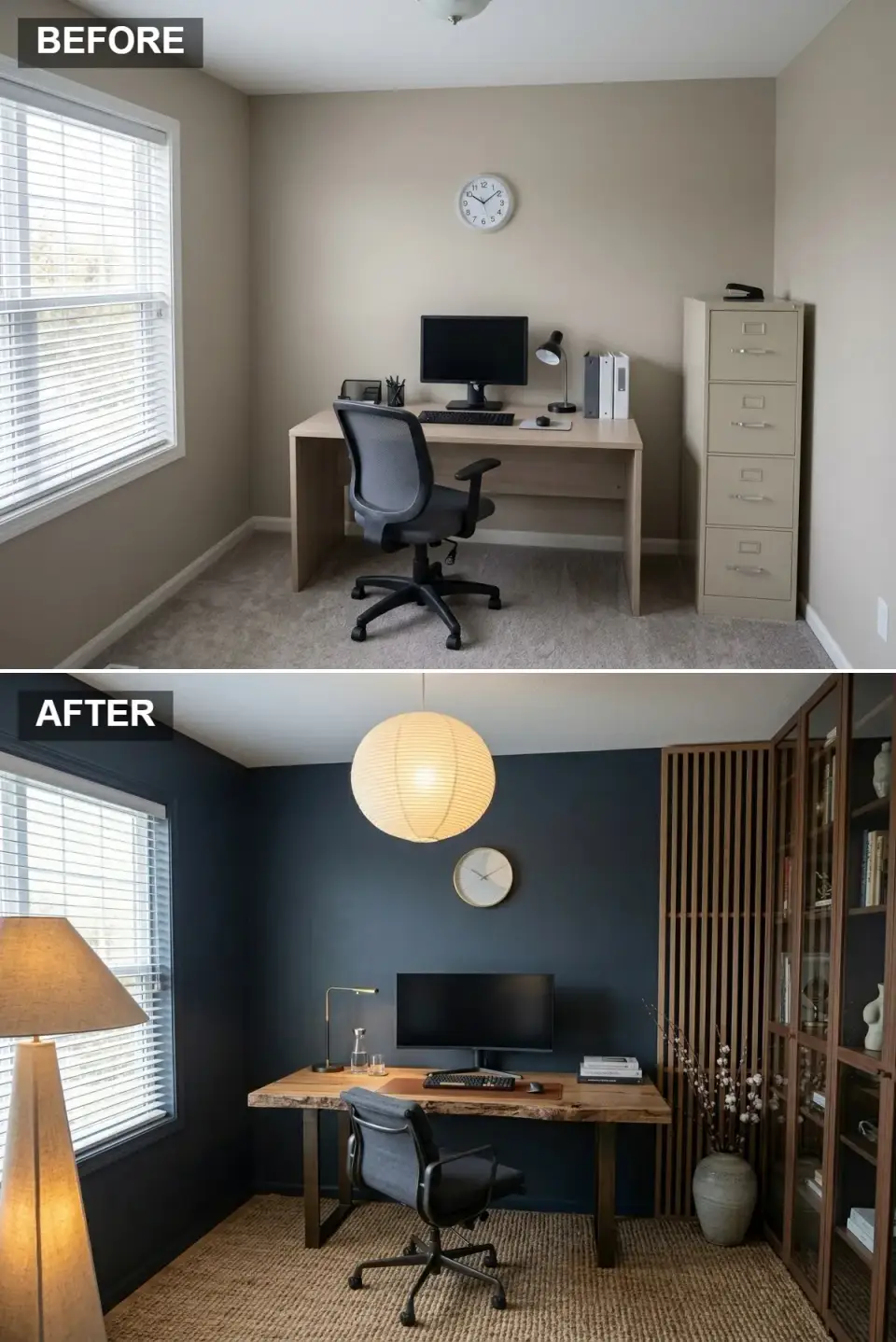
Sketch this direction first when an office “needs to feel like a deep breath.” The walls go to a soft, dusky navy (Farrow & Ball Hague Blue or Benjamin Moore Hale Navy are two reliable choices), and the particle-board desk gives way to a live-edge walnut slab on dark steel legs; West Elm's Wickham desk gets close to that look without sourcing a custom slab. A slatted walnut screen stands just right of the desk, in front of glass-fronted walnut bookcases, and supplies the vertical rhythm Japandi rooms rely on. Overhead, one oversized round paper lantern in the Noguchi Akari mould (an authorized reissue rather than a knockoff) softens every hard edge in the room.
Navy and walnut carry almost everything here. Midnight Navy (#2C3E50) wraps the walls right up to the ceiling line, so the white window trim and the glowing lantern look brighter against it, while the live-edge walnut (#8B5A2B) of the desktop is the warmest, most figured surface in view and the place the eye comes to rest.
Underfoot, natural jute (#C0A080) replaces the beige carpet almost wall to wall, a coarse straw tone that sits between the dark paint and the reddish wood. Charcoal (#4A4A4A) turns up in the upholstered task chair and the desk legs, a mid-grey bridge that stops the walnut screen and the navy from fighting each other.
Painting a room this small this dark sounds risky, yet the deep colour blurs the corners and the clutter that gathers along them, provided warm light comes from more than one height: the lantern overhead, the linen-shaded floor lamp by the window and the slim brass lamp on the desk. A matte black Anglepoise Type 75 would suit the desk just as well, and either way the walnut should remain the only sculptural object on the work surface. The rendering runs jute across nearly the whole floor; a rug sized to the chair zone, with a margin of bare floor around it, keeps the warmth and adds the negative space Japandi depends on.
Leave the gallery wall out entirely. A single stoneware jar holding a few cotton stems, like the one beside the screen, says more than ten frames would. If the budget allows one splurge, spend it on the slatted divider in real timber, because peel-and-stick vinyl slats look flat both on camera and from across the room.
Sleek & Serene: The Minimalist's Dream
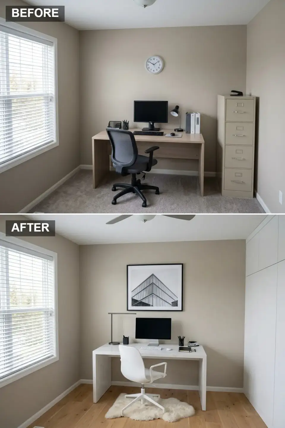
When a home office needs to look clean on Zoom and stay clean in daily use, push it this way. In the rendering the original greige is still on the walls while everything added is white, which already reads calm; the fuller version takes walls and cabinets to Benjamin Moore White Dove or Sherwin-Williams Alabaster, both with just enough cream to keep a white room from feeling like a dental office. The flat-front storage running floor to ceiling along the right wall is the kind of thing an IKEA PAX run, painted to match the walls, can imitate at a fraction of true millwork pricing, and the white waterfall desk is the piece a custom quartz slab would make permanent. One large black-and-white architectural photograph in a thin black frame anchors the wall behind the desk.
Soft White / Cream (#F5F5F5) belongs to the tall cabinet wall and, once the room is finished, to the painted walls too: a warm white that throws window light around without turning clinical. Pure White Quartz (#FFFFFF) is the desk, a waterfall slab whose crisp folded edges look custom and wipe clean in seconds.
The light oak floor (#E0C0A0) that replaces the carpet is what keeps this much white from feeling cold. Matte Black (#000000) supplies the punctuation in the picture frame, the arm of the desk lamp and the handful of small desk accessories.
Hold walls, cabinets and trim inside one off-white family, since a cool white beside a warm one is the quickest way to make a minimalist room look cheap. Closed storage is the reason the cabinet wall exists: anything used less than weekly lives behind those doors rather than on an open shelf. The sheepskin under the white chair matters too, giving a room of smooth surfaces its one patch of soft texture, and an inexpensive Icelandic hide does that job as well as a costly one.
The architectural print is the only art this room needs, so resist hanging a second frame beside it. The cabinet fronts show no hardware at all; push-to-open latches create that look but tend to get sticky after a couple of years, whereas a routed finger-pull channel along the top edge keeps the fronts plain and ages better.
Zen & Balanced: A Japandi Retreat
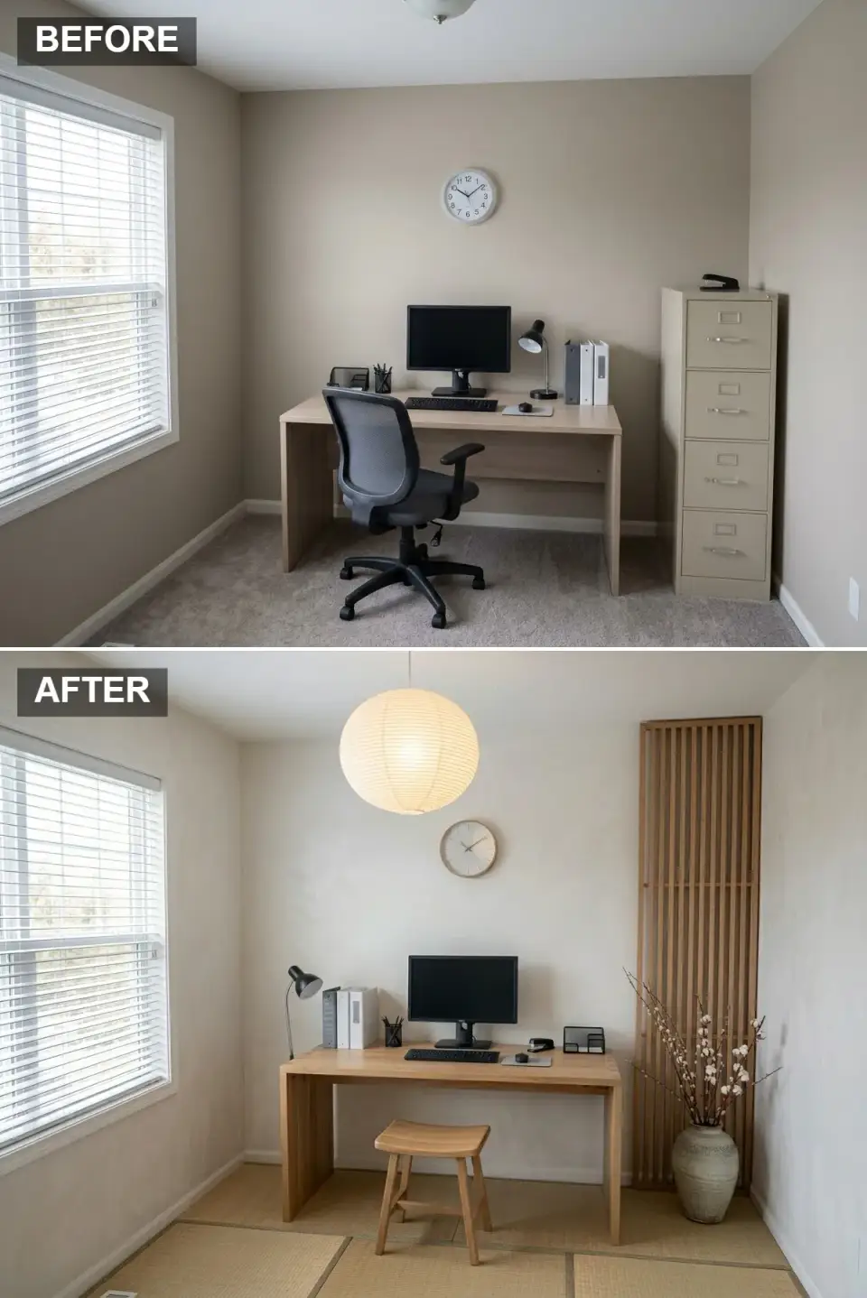
This is the quieter cousin of the moody navy version above: same Japandi DNA, different temperature. The walls get a lime-wash treatment in a soft, milky off-white (Bauwerk Colour's Bone is a good match), which gives that subtle plaster movement no flat paint can fake. The desk is light ash in a simple waterfall form, paired with a low wooden saddle stool instead of a proper office chair. In the rendering tatami mats cover the entire floor, the boldest move in this version, because it resets the room from “office” to “study” at once. A single tatami runner under the work zone is the lighter version, and it can be rolled up whenever a castered chair needs the floor back.
The walls carry Lime-Wash Bone (#EBEBE0), a milky off-white whose soft, cloudy movement shows most where window light grazes across it. Light Ash / Oak (#D0B090) is the desk, a pale, tight-grained timber that looks quiet rather than rustic.
Tatami Straw (#C0B080) covers the floor in woven grass mats that read warm underfoot, and Medium Wood (#A08060) gives the tall slatted screen in the corner a slightly deeper tone, enough contrast that the pale desk does not dissolve into the walls.
Lime wash and clay paints (Backdrop's Pas de Deux, Portola's Roman Clay) register as texture in person and on a webcam in a way no roller-applied flat finish manages. The stool is what turns the room into a study, yet anyone facing two-hour video calls should keep an ergonomic chair in reserve, because a backless seat is not fair to a spine for that long. For greenery, a few branches in a stoneware jar, like the cotton stems by the screen, suit this restraint better than a potted fiddle-leaf fig.
The desk in this rendering still holds the binders, wire tray and stapler from the old setup, and those are the first things to clear; three objects on the surface is the ceiling once the room is dressed. Keep the wall above the desk bare apart from the small clock, since the lime wash itself is the texture worth looking at.
The Distinguished Scholar: A Classic Library Feel
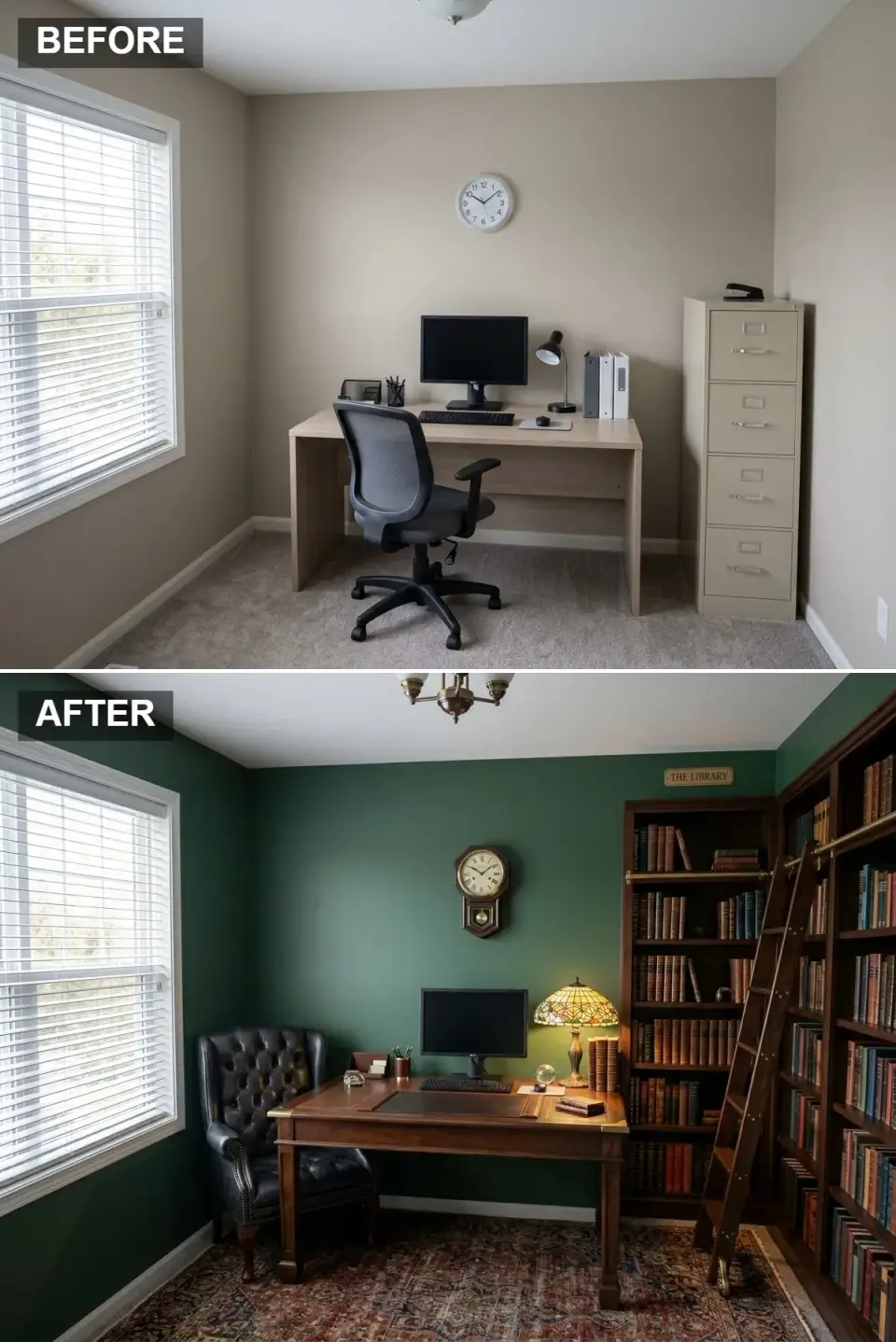
This direction suits a Charleston historic-district office, and it is at its best on rainy mornings. Walls go to Farrow & Ball Studio Green or Sherwin-Williams Pewter Green. Neither is the predictable hunter, and both photograph like a proper Edwardian study. The desk should be substantial: a vintage partner's desk if you can find one, or Restoration Hardware's St. James as a new-build stand-in. A black button-tufted leather wingback beside the desk (Hickory Chair makes a good one) and a Tiffany-style lamp finish the period without tipping into theme-park territory.
Studio Green (#2A4B38) wraps the walls, a deep traditional shade that feels scholarly without becoming theatrical. Dark Walnut (#4A3020) appears in the desk and in the floor-to-ceiling bookcases that turn the corner, heavy, warm-grained wood that holds its ground against the green.
Black Leather (#202020) is reserved for the tufted wingback by the window, a finish that earns its patina over decades rather than seasons. Persian Rust (#803020) comes from the rug, whose reds and rusts carry most of the colour at floor level.
Fill the shelves with books that are actually read; volumes bought by the linear foot look obvious on camera and undercut the seriousness of the room. The rolling ladder on its brass rail is the right kind of indulgence, as long as it is a working ladder and not a decorative leaning shelf. Here a single Persian rug lies directly on the floor, and setting it over a larger jute base is how to make the room look accumulated over years rather than delivered in one truck.
One brass picture light over a framed map or print would add more atmosphere than the brass ceiling fixture shown. The white window trim and baseboards are what hold this room back: painting trim, doors and ceiling the same green produces the fully enveloped effect the style depends on.
Monochrome Chic: Bold & Modern
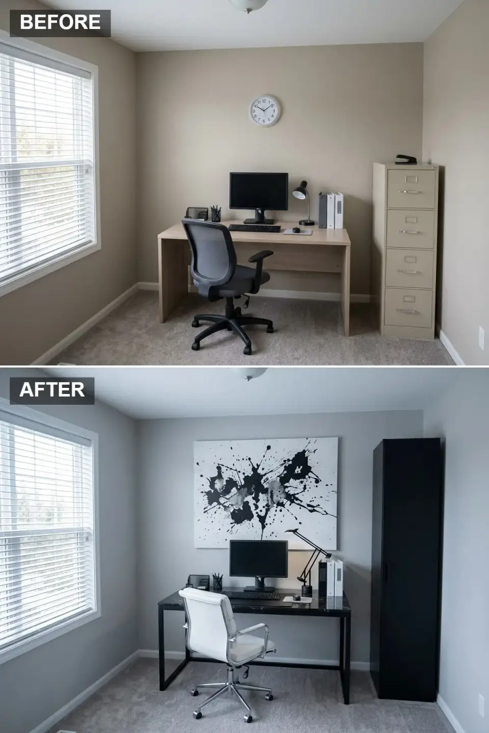
This is the look for anyone who wants their home office to feel like the apartment of someone who edits magazines for a living. Walls go cool (Benjamin Moore Coventry Gray or Sherwin-Williams Repose Gray), and the desk becomes the sculptural moment: a black metal frame with a honed black marble top, ideally something with strong white veining (CB2's Stilt or West Elm's marble-top desks both do this well at accessible prices). One oversized abstract canvas, hung low and close to the desk, is the room's heartbeat.
Cool Light Grey (#B0B0B0) on the walls is neutral enough that every black and white piece registers sharply against it. The desk is the sculptural moment: Honed Black Marble (#202020) with fine white veining, which doubles as the only pattern in the room apart from the canvas.
Matte Black (#000000) repeats on the desk frame, the tall single-door cabinet and the angled task lamp, giving the room its graphic structure. Pure White (#FFFFFF) on the padded leather desk chair is the counterweight, the one large light shape set against all that black.
Commit fully, because a single wood-toned accessory in this scheme looks like a mistake rather than a layered choice. The ink-splash canvas proves that one oversized piece beats a gallery wall, and Twentieth Editions or Minted sell affordable large-format prints in that spirit. With a palette this strict, texture has to do the remaining work, so set matte black beside honed marble, smooth leather and the chrome of the chair base, and never put two neighbouring finishes at the same sheen.
Silhouettes need to stay slim and architectural, like the thin-legged desk and narrow cabinet here; chunky upholstery looks swollen in a monochrome room. Lighting needs layers as well, since the lone flush ceiling light in the rendering would leave a black-and-grey room feeling like a cave after sunset, and a slim floor reader beside the chair would finish what the task lamp starts.
Bohemian Rhapsody: Texture, Plants, and Personality
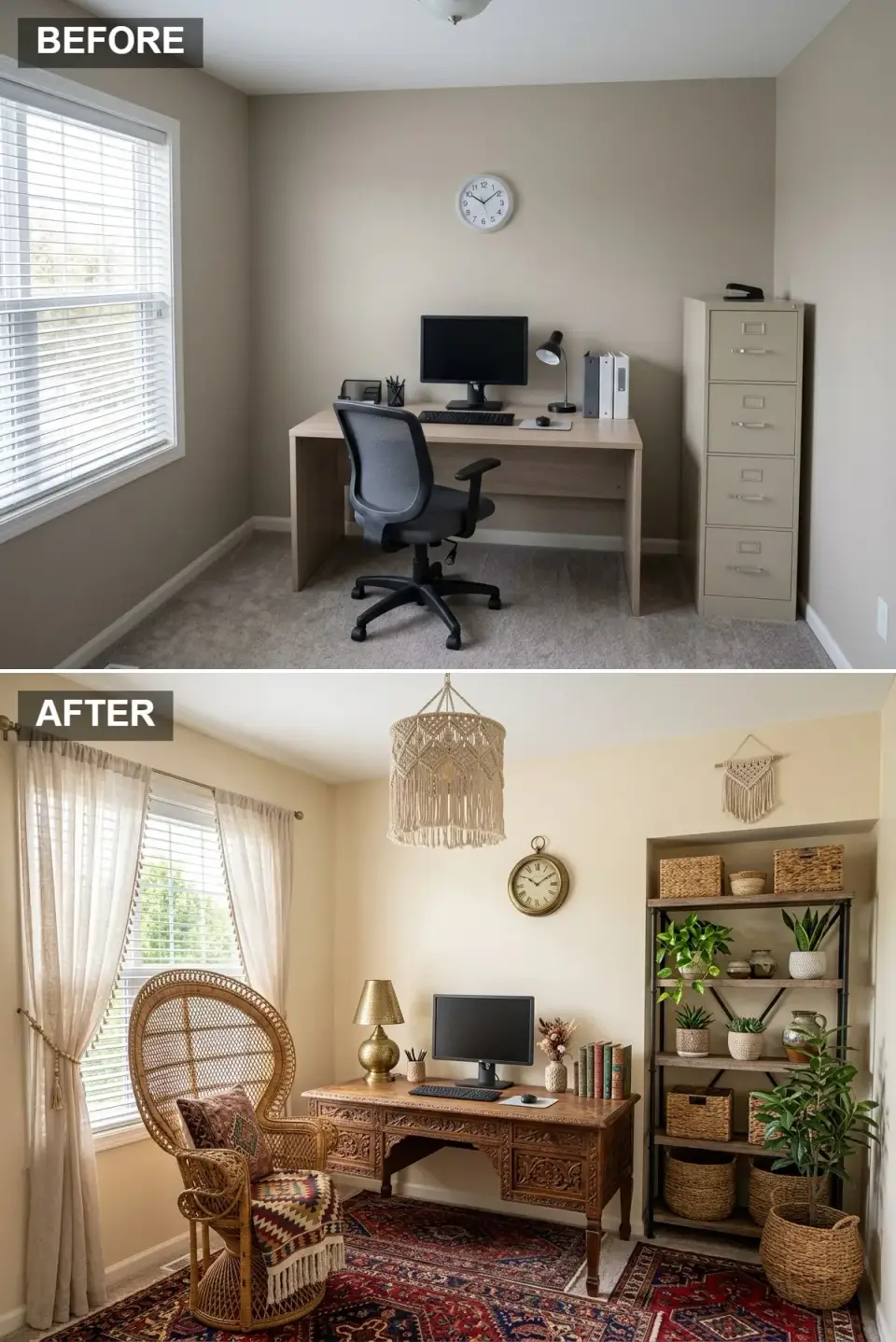
The boho office is where you bring out everything you collected on every trip and stop apologizing for it. Walls warm up to Sherwin-Williams Natural Linen or Backdrop's Sand Castle, and the ornately carved desk (Jungalow's pieces or anything from World Market's Madras line) becomes the conversation starter. The peacock chair is bold but functional, especially Anthropologie's perpetual Lulu version. Layered linen curtains soften the light, and the open shelving (Lulu and Georgia's Fenmore works well for this) spills with potted plants, woven baskets, and handmade ceramics.
Warm Cream (#F0E0C0) on the walls gives the room its glow and flatters every other warm tone in it. Carved Mango Wood (#906040) is the desk, and its deeply carved drawer fronts are the detail people notice first.
Terracotta and rust (#A04030) arrive through the red-ground rug and the kilim throw on the peacock chair, the earthy reds that anchor the whole scheme. Rattan and jute (#D0B080) run through that chair, the woven baskets on the shelves and the macramé pendant, and they carry the texture of the room.
The rendering uses one large Persian-style rug; layering a flat-weave kilim over a jute base is the next step if the floor needs more depth, provided the two share warm tones and differ in scale. Mix at least three patterns, as the rug, the throw and the cushion do here, but keep them inside one colour family, because boho falls apart when patterns brawl. Choose real plants over fakes, since in this much window light artificial leaves give themselves away at three feet.
Brass ties the collection together, from the hammered lamp base on the desk to the round wall clock and any planter trims added later. The small macramé hanging on the right wall could give way to a larger commissioned piece; custom work from independent makers on Etsy is less likely to look like the version pinned on every board.
The High-Tech Hub: A Modern Productivity Station
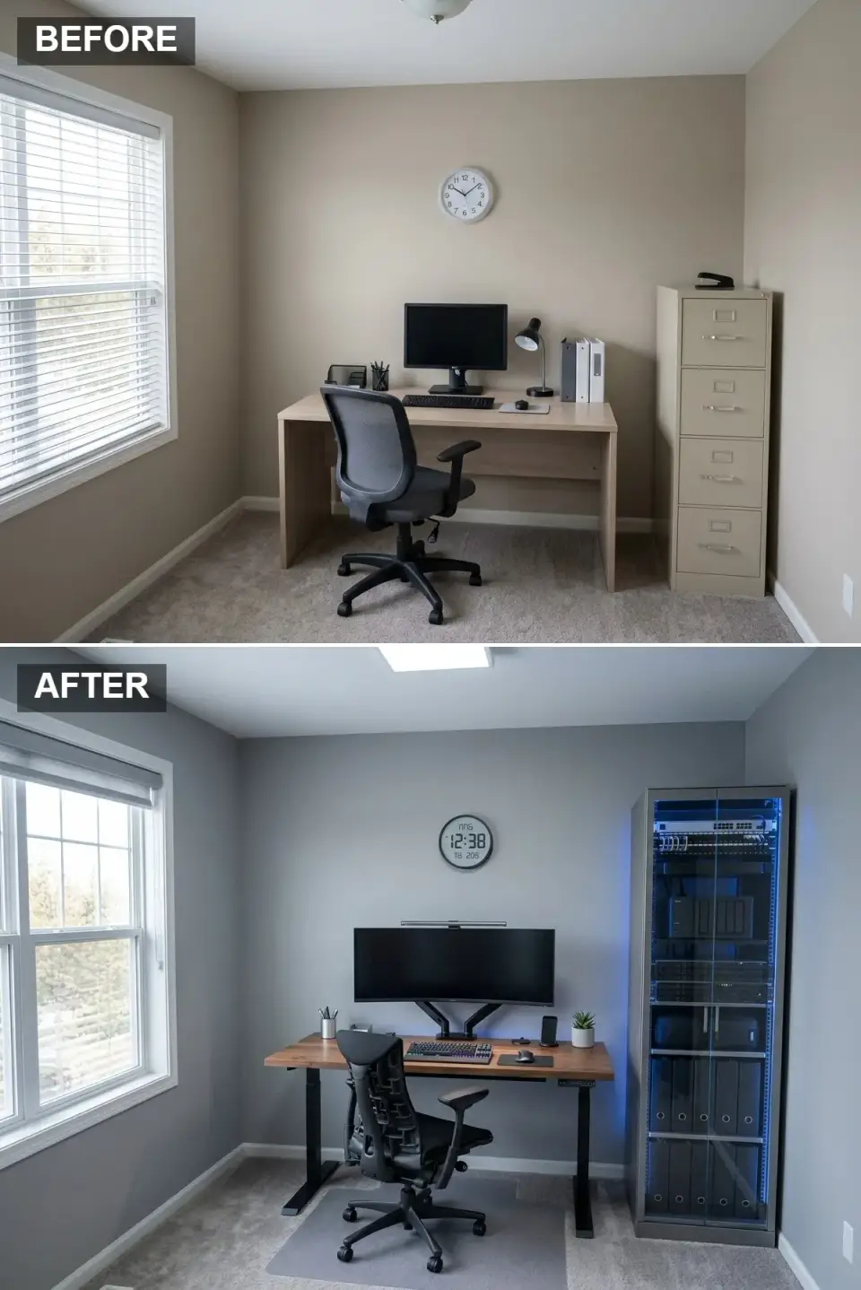
This is the office for people who actually live at their desk: software founders, video editors, day-trading dads. Walls in Sherwin-Williams Network Gray set a professional, screen-friendly backdrop. The sit-stand desk has to be load-rated for serious gear; we would specify Uplift V2 or Fully Jarvis with a solid walnut top. Ergonomic chair non-negotiable: Herman Miller Aeron or Steelcase Leap, both worth their resale value. The glass-fronted server cabinet with cool blue LED accent lighting is the optional flourish that takes this from “good setup” to “actually photographed for a magazine.”
Network Grey (#808080) is a cool, flat grey that sits quietly behind monitors and looks professional on video calls. The Walnut Top (#705040) of the sit-stand desk is the only warm surface in the room, and it softens the austerity of the steel and screens around it.
Matte Black (#101010) unifies the ultrawide monitor, the twin monitor arm, the desk legs and the mesh ergonomic chair. The rack in the rendering has a pale steel frame, so the Electric Blue LED (#0050FF) glowing behind its glass door does the accent work on that side, a cool edge that a strip behind the monitor would echo.
Cable management makes the whole visual difference between a tech enthusiast's office and a dorm room, so give it a full weekend with trays, raceways and Velcro ties rather than zip ties, which bite into cable jackets over time. Monitor arms like the twin arm here (Ergotron LX is the usual professional pick) free so much surface that a 60-inch desk starts to feel like 72. A bias light behind the screen, from Govee or MediaLight, is easier on the eyes during long sessions and looks like designed lighting on camera.
The small succulent beside the phone stand is a start, but a room this full of hardware needs one real, mid-size plant to feel lived in. A glass-door rack also needs proper ventilation, because humid Southern summers can damage enclosed gear if the cabinet cannot breathe.
Mid-Century Marvel: Integrated & Elegant
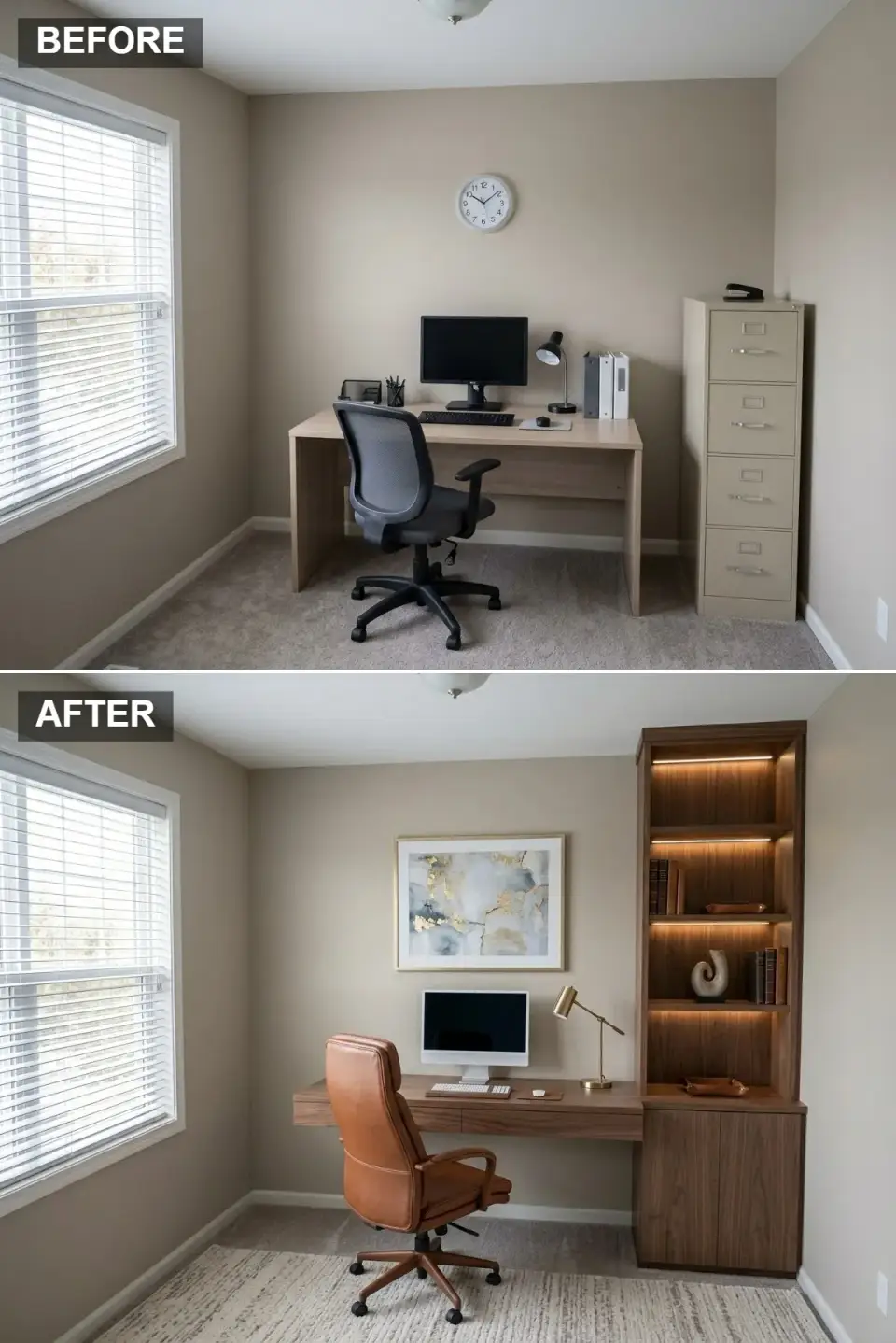
If you have the budget for one custom-built moment in your home office makeover, put it toward integrated walnut millwork in the mid-century vein. The original beige walls can stay (Benjamin Moore Manchester Tan is a near-perfect base), and the real work happens in the carpentry: a long floating walnut desk that joins a tall shelving tower and lower closed cabinets, all clean-lined and warm-finished. Integrated 2700K LED tape inside the shelves washes light over a tight edit of objects. The chair has to be tan leather mid-century, ideally Knoll's Pollock or Eames Soft Pad in saddle leather.
Warm Beige (#D0C0B0) stays on the walls as a soft backdrop, which lets the American Walnut (#6A4B35) millwork carry the room: the floating desk, the lit shelving tower and the closed cabinets below it all share one open-grained finish.
Saddle Tan Leather (#B07040) on the swivel chair is a vegetable-tanned hide that softens and darkens with use. Brushed Brass (#C0A060) shows up in the desk lamp and the thin frame around the abstract print, a quiet shine rather than lacquered yellow.
Custom millwork is the splurge; stained plywood IKEA cabinets under an aftermarket walnut-veneer top can imitate it, and Semihandmade sells ready-to-install fronts for exactly that job. Keep the shelf lighting warm white, 2700K and never above 3000K, because cooler LED tape drains the warmth out of walnut the moment it is switched on. Tapered legs on any freestanding piece added later, down to the wastebasket, are the detail that sells the period.
The textured rug in the rendering is sized correctly, with all five chair casters on it, and a geometric pattern at the same size would push the period harder. For a second light source, a ceramic lamp with a linen drum shade on the cabinet top will look more honest than most sculptural mid-century reproductions, which tend to read as costume.
Industrial Edge: Brick, Metal, and Character
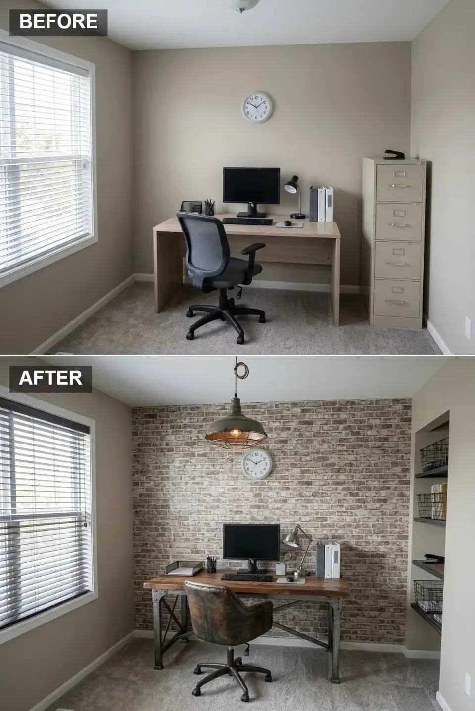
Industrial has not disappeared; it has simply grown subtler. The look suits converted Charleston warehouse condos and Atlanta loft conversions where the bones already lean rough. In the rendering the back wall is a pale, whitewashed brick, and without real masonry the convincing substitutes are a thin-cut brick veneer such as Old Mill Brick's Brickwebb or a hand-troweled limewash finish, never wallpaper, which photographs flat. The desk pairs a reclaimed-pine top with a riveted, X-braced steel base of the kind a metal fabricator can build to size, and a distressed leather swivel chair finishes the rig.
The brick wall is specified as Exposed Red Brick (#A06050); the rendering shows a lighter, limewashed version, and unpainted red brick is the warmer of the two choices. Reclaimed Pine (#806040) forms the desktop, a knotted, distressed board whose nail holes and wear lend the room its history.
Gunmetal Iron (#505050) is the structure: the steel desk base, the dark shelf brackets in the wall niche and the metal shade of the caged pendant. Distressed Brown Leather (#705030) on the chair is the warm counterweight to all that metal.
Brick veneer needs to be thin-cut and individually mortared rather than bought in panels, since panels look like a theme restaurant from across the room. The niche here holds flat shelves with wire baskets; pipe-and-plank shelving is the familiar alternative, and if it goes in, use black iron pipe rather than galvanized and seal the boards with satin urethane instead of leaving them raw. One bulb per fixture, like the single caged bulb in this pendant, is plenty, because multi-bulb Edison chandeliers tipped the style into parody around 2018.
Baskets like the ones on those shelves should be matte black powder-coated rather than raw wire. The room still wants one soft element, a sheepskin over the leather chair or a wool runner on the carpet, so it reads as a study and not a workshop.
Scandi-Simplicity: Light, Airy, and Organic
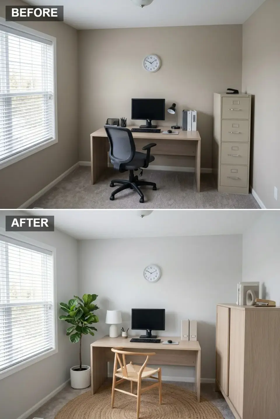
Scandi works in a Charleston rental as well as it works in a Stockholm apartment, partly because the South gets the same low winter light Northern Europe does. Walls go to Benjamin Moore Classic Gray or Sherwin-Williams Snowbound, both barely-grey, both bouncy. Furniture stays light: a Skagerak or Ferm Living desk in oak, a Carl Hansen wishbone chair (the Wegner CH24, the original) at the desk, and a tall closed storage cabinet from Muuto. A round natural-fiber rug from Lorena Canals defines the work zone, and a single fiddle-leaf fig in a white Bergs Potter does the room's organic work.
Pale Mist Grey (#E0E0E0) on the walls is barely there, a grey that bounces the window light without any blue cast. Blonde Oak (#D0C0A0) runs through the desk and the tall two-door cabinet, the gentle wood at the heart of the Scandi vocabulary.
Natural jute (#C0B080) in the round rug marks out the work zone and warms the carpet without adding visual weight. Matte White (#FFFFFF) appears only on the fig's planter and the ceramic table lamp, calm and never glossy.
Keep every fixed surface white or pale grey and let the wood and the fig supply all the warmth. A wishbone chair is the right desk chair for someone who reads and writes more than types; choose the woven paper-cord seat shown here over an upholstered pad. The window still wears its white blinds, and sheer linen panels would soften the light more in this look; Magnolia Home and Loaf both make affordable versions that hang properly.
Live plants matter more here than in any other direction on this list, so a trailing pothos on top of the cabinet would keep the fig company. Skip the predictable flat-pack Scandi pieces as well; one or two real designer items make the room look collected rather than assembled.
Retro Revival: Warm Tones and Iconic Design
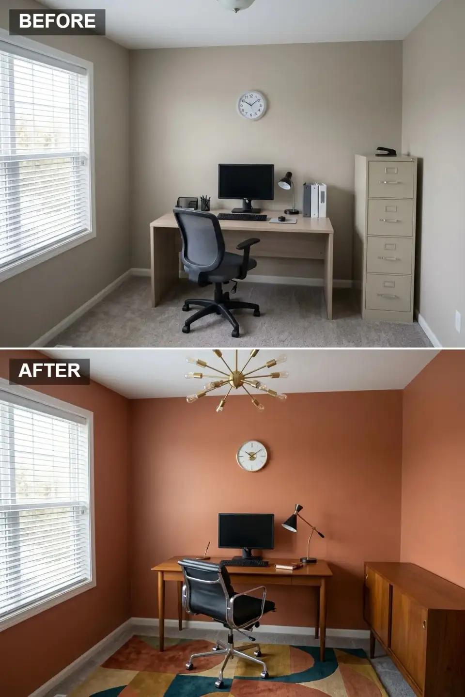
Where the Mid-Century Marvel above is the polished, integrated version, this one is the more colorful, period-faithful cousin. Walls go bold: Farrow & Ball Charlotte's Locks or Sherwin-Williams Cavern Clay are two terracottas that suit it. The desk and matching credenza should be vintage teak if you can find them on Chairish or 1stDibs, or quality reproductions from Joybird and Rove Concepts as the second-best. The Eames Soft Pad management chair in black leather is the chair you actually want; the sputnik chandelier is the chandelier you actually want. Both are worth the splurge.
Terracotta Orange (#B06040) covers every wall and announces the era the moment the door opens. Vintage Teak (#906030) is the tapered-leg desk and the sliding-door credenza beside it, a medium-toned wood with the rich grain the period is known for.
Black Leather and Aluminum (#101010) make up the executive chair, the classic mid-century pairing of padded hide and polished frame. Aged Brass (#C09050) is the sputnik chandelier, whose spokes act as the room's jewelry, and the brass stem of the desk lamp echoes it lower down.
There is no reason to fear the bold wall, since terracotta, mustard, olive and burnt sienna all look sophisticated beside warm wood. Two wood tones can share the room, as teak and walnut get along, but both should stay in the warm family, which rules out whitewashed oak. Limit the genuine icons to one: a real Eames chair beside a real sputnik and a real Knoll desk is too much, so buy the chair and reproduce the rest.
The geometric rug in teal, ochre and rust is the right idea, and it is large enough that every chair caster sits on it; Lulu and Georgia and Revival Rugs both carry earthy geometrics in that vein. Leave out the bar cart, because period-correct does not have to mean costume.
The Executive Suite: Dark, Luxurious, and Commanding
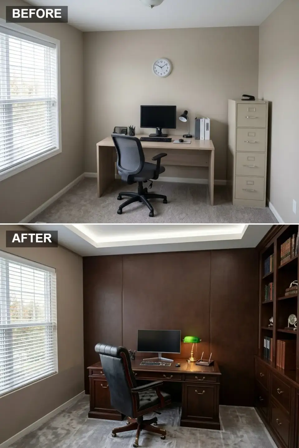
Choose this direction when a home office has to read like a partner's office at a downtown law firm, a brief that fits the formal rooms of the Charleston historic district. The back wall is clad in leather panels, a custom millwork job in which a leather supplier provides the hides and a cabinetmaker builds the framing. A tray ceiling with concealed cove lighting changes the room more than any single piece of furniture. The desk should be a substantial pedestal piece (Hooker Furniture's Telluride or RH's Maxwell are new-build options), paired with a high-back tufted leather executive chair in a dark cordovan brown rather than safe black.
Espresso Leather (#403020) panels the wall behind the desk, a dark, softly textured surface that absorbs light and gives the room its quiet authority. Dark Mahogany (#503020) is the pedestal desk and the built-in bookcase on the right, a reddish brown with a hand-rubbed finish.
Dark Cordovan (#101010) on the chair sits so close to black that its brown undertone surfaces only under warm light. Warm White Wash (#F0E0C0) is the 2700K glow from the cove around the tray ceiling, the indirect light that gives this dark room its depth.
Cove lighting is what turns a dark room into a designed one, so spend on quality LED tape (Hafele or Diode LED) and a proper diffuser rather than the under-cabinet strips sold for kitchens. Real leather panels age well, while vinyl alternatives turn shiny within five years and never recover. The green banker's lamp on the desk shows how one bright accent lifts all that dark wood, and a vividly coloured print or a stack of clothbound books in jewel tones would do the same.
The bookcase here runs right up to the ceiling, which is how built-ins should look in this style; half-height versions read as builder grade. Underfoot, one tight-weave wool and sisal blend under the desk is enough, since any further pattern looks busy in a room this rich.
Gatsby Glamour: Art Deco Opulence
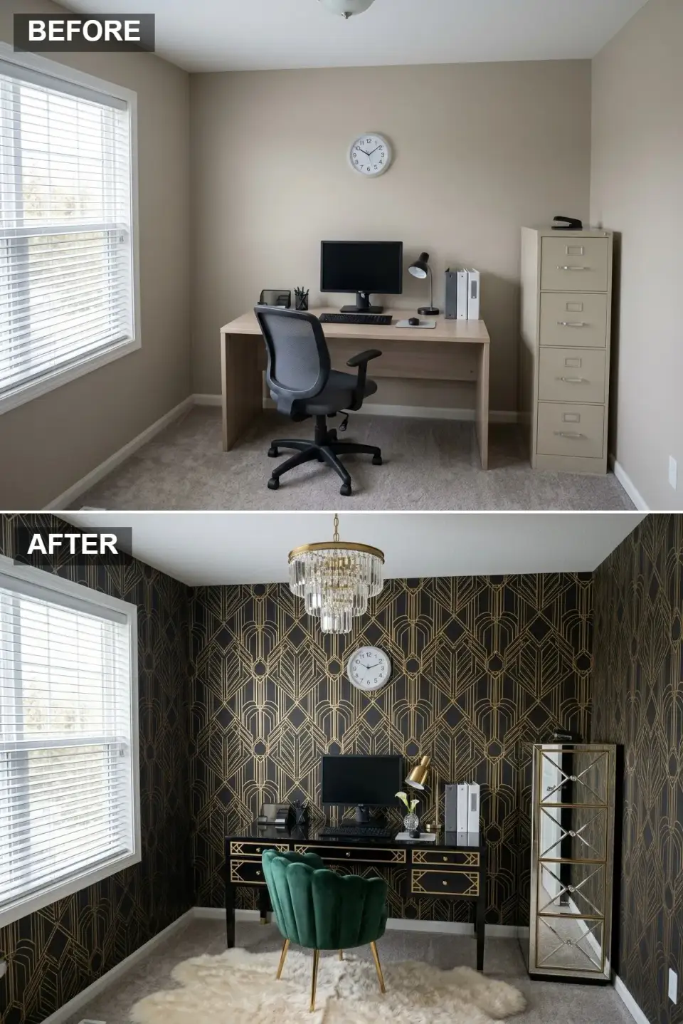
A favorite stretch project for anyone who wants their home office to feel like a personal indulgence: the Art Deco direction is unapologetic, jewel-toned, and built on three big swings. The wallpaper is the first: Cole & Son's Geometric II or House of Hackney's Artemis, both in black with metallic gold motifs. The chair is the second: an emerald velvet scallop-back from Anthropologie's Effie line or, if budget allows, a vintage Maison Jansen reproduction. The third is the lighting: a real crystal-and-gold tiered chandelier, not a dupe. A mirrored-front cabinet from Hooker or a vintage Hollywood Regency console finishes it.
Black and Metallic Gold (#101010) wallpaper covers every wall in a high-contrast geometric pattern, the Deco signature reduced to line and arch. Emerald Velvet (#005030) on the scallop-back chair is the one jewel tone strong enough to hold its own against it.
Antiqued Mirror (#C0C0C0) fronts the tall gold-trimmed cabinet in the corner, bouncing light back into a room whose walls soak most of it up. Crystal and Gold (#E0E0E0) is the tiered chandelier, whose prisms scatter what light there is.
Wallpaper, chair and chandelier are three bold swings, and three is the most this room can take before it turns theatrical. Velvet wears better than it photographs, but a chair used every day should be covered in a stain-resistant performance velvet. Mix gold finishes on purpose: brushed brass on hardware, polished gold on the chandelier, antiqued gold in picture frames. One metal family in several finishes is what gives Deco its layered look.
For styling, a single marbled notebook and pen on the black lacquer desk is enough, and the binders left over from the old room in this rendering should go. The white sheepskin under the chair is the modern softener, a far better choice today than the black-and-gold marble floor of the original era, which would now feel like a hotel lobby.
Practical Tips for Any Home Office Makeover
Plan around the work before the room. Before any paint chip or chair link gets pinned, write down what you actually do at the desk: Zoom calls, deep writing, monitor-heavy editing, or paper-and-pen sketching. That dominant task should drive the lighting, the desk depth, and the chair priority more than the style brief does.
Lighting needs three layers every time, because one overhead source is never enough. Use a ceiling fixture for ambient light, a slim task lamp at the desk, and a third source, such as a floor reader or a picture light, for atmosphere on video calls. Once that third layer is in, every camera angle in the room improves. Money follows a similar order: spend on the chair first, then the desk, then everything else. An Aeron, a Steelcase Leap, or a Humanscale Freedom holds its value for a decade, and while the desk surface matters less than people expect, the chair matters more than most people want to pay for.
The wall behind your chair is your set. It is what every client, colleague, and recruiter will see for the next five years, so style it like a still-life shoot rather than leaving it to chance. After the room is dressed, give it two weeks before adding anything new. Sitting in it that long, you will often find that much of what felt missing on day one no longer feels missing by day fourteen.
Where These Looks Land in the South
In Charleston, SC, the Classic Library, Mid-Century Marvel, and Executive Suite all sit naturally in the historic district's high-ceilinged rooms, and Lime-wash Japandi works well in the older homes with lower light. Savannah, GA suits Bohemian and Art Deco, which find their audience in the Victorian-era houses around the squares, where the walls already want pattern.
Farther south, Naples, FL favors Scandi-Simplicity and the Minimalist's Dream, both of which lean into the bright coastal light and contemporary builds; Industrial looks wrong for that climate. Nashville, TN leans toward Mid-Century Marvel and Retro Revival, which suit the older houses of East Nashville and Belmont, while the High-Tech Hub fits the Brentwood new-builds. In Atlanta, GA, Industrial Edge belongs in the Westside warehouse conversions and Monochrome Chic in the new Buckhead high-rises.
Frequently Asked Questions
How much does a home office makeover usually cost?
A budget-conscious refresh (paint, a sit-stand desk, and a quality chair) runs $1,500 to $3,500 in 2026 pricing. A mid-range overhaul with custom shelving, lighting upgrades, and a serious chair sits in the $5,000 to $10,000 range. The integrated mid-century or executive directions in this guide, with custom millwork and tray ceilings, push past $20,000 in most Southern markets.
What's the single best upgrade if you can only change one thing?
Lighting. Replace the single overhead fixture with a layered setup (one warm-white ceiling source, one slim task lamp, one accent light) and the room reads completely different on camera and in person. Furniture upgrades make a difference; lighting changes the whole room.
Are dark wall colors a mistake in a small home office?
Usually the opposite. A small office painted in a deep, enveloping color (Studio Green, Hague Blue, Hale Navy) actually feels larger because the walls disappear at the edges instead of bouncing your eye around the perimeter. The trick is paint plus enough warm lighting, never one without the other.
Should the home office match the rest of the house?
It should rhyme, not match. The wood tone, metal finish, or one anchor color should connect to the rest of the home, but the office is a room where committing to a single strong style (a library, an Art Deco jewel box, a Japandi retreat) pays off more than it does in a living room you share with everyone.
Which of these directions is best for daily Zoom calls?
The Mid-Century Marvel and Minimalist's Dream both photograph beautifully on video calls because the back wall reads as designed without being distracting. The Industrial Edge and Bohemian Rhapsody can read busy on camera unless your video framing is tight. Whatever direction you pick, position the desk so a window is in front of you or to the side, never behind.
How long does a full home office makeover take?
For a paint-and-furniture refresh, plan one weekend for the work plus two weeks for furniture lead times. For a build with custom millwork, lighting upgrades, or wallpaper, six to ten weeks is realistic, since upholstered chairs and quartz tops often carry long lead times. Order the chair and the millwork first; everything else can catch up.
Sources & References
- Farrow & Ball Color Library: paint references for Studio Green, Hague Blue, and Charlotte's Locks used throughout this guide. farrow-ball.com
- Benjamin Moore Color Tools: Hale Navy, White Dove, Coventry Gray, Manchester Tan, and Classic Gray references. benjaminmoore.com
- Sherwin-Williams Color Visualizer: Alabaster, Pewter Green, Repose Gray, Network Gray, Snowbound, Cavern Clay paint codes referenced. sherwin-williams.com
- Herman Miller Aeron + Steelcase Leap ergonomic standards: pricing and BIFMA-rated specifications for the office chair recommendations. hermanmiller.com
Choosing Your Home Office Style Family
Thirteen directions sounds like a lot, but they really sort into three families: the quiet rooms (Japandi, Scandi, Minimalist), the warm rooms (Library, Mid-Century, Bohemian, Retro), and the bold rooms (Monochrome, Industrial, Executive, Art Deco, High-Tech). Pick the family first, then pick the version inside it. The home office makeover that actually sticks is the one that fits how you work, what you're drawn to on a Tuesday morning, and what you can afford to do well, not the one that wins the most Pinterest saves.
If you found a direction here that pulled you in, you might also like our closer look at eleven workspace transformations from one dusty corner, our full walkthrough of a Nordic Scandi room build, the after-hours Art Deco speakeasy office reveal, or our reflective piece on the quiet autobiography your home decor writes about you.
Pick the direction. Sit in it for two weeks. Then decide what to layer in next.
Transformations Desk
The Layered Homes editorial teamThe Transformations Desk produces the before-and-after design studies: one imagined starting space (a room, a facade, a backyard) shown in several design directions, each with a palette and a cost estimate.
More from the Transformations Desk →
Reader notes