


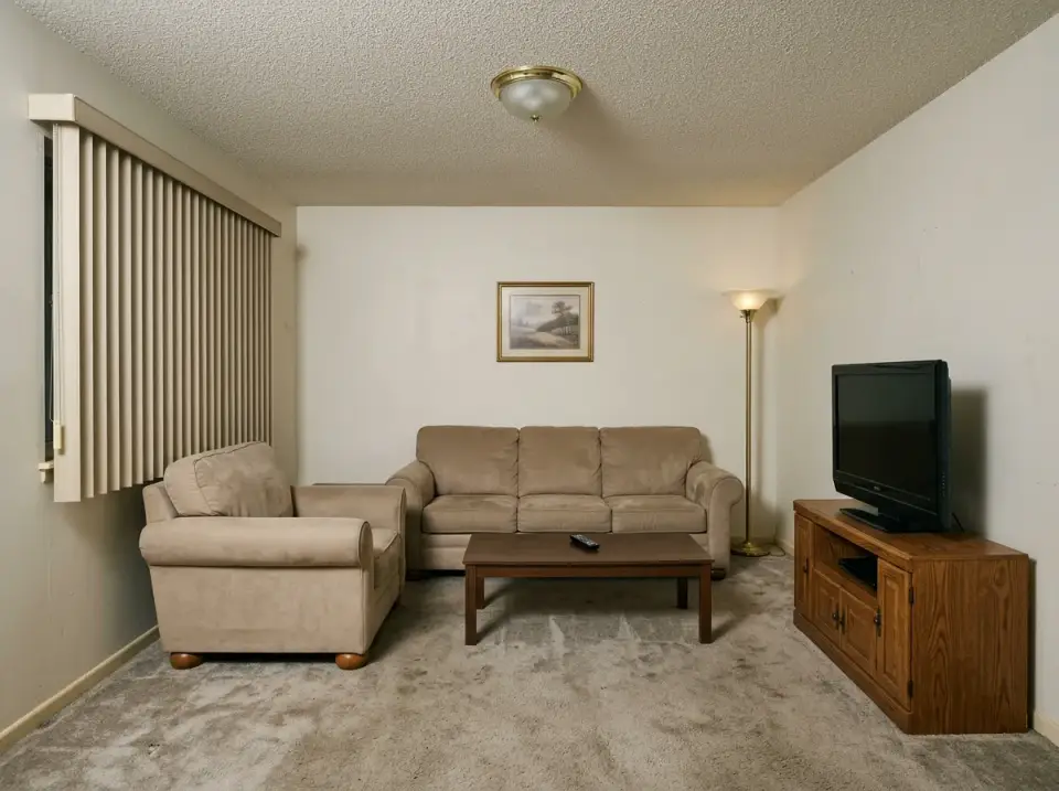
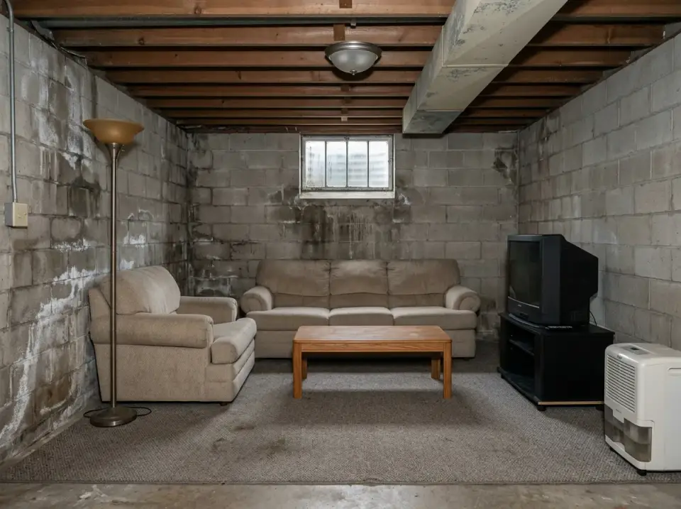
Scandi is the one design language I get asked about more than any other — and the one that gets misinterpreted most often as "white walls, IKEA sofa, done." It isn't. Real Scandinavian interiors are built on restraint, functional honesty, layered texture, and warm light — and they absolutely allow for color, moodiness, and personality when you understand what they're doing underneath. I've styled a lot of Charleston living rooms into one version or another of the Scandi family over the last seven years, and the eleven directions below are the conversations I have with clients who bring me a room that feels stuck. Same room, eleven languages.
Contents
- 1. Bohemian Warmth Meets Nordic Cool
- 2. Coastal Breeze & Scandinavian Light
- 3. Rustic Cabin Cozy
- 4. Moody Maximalism with a Scandi Spine
- 5. The Japandi Sanctuary
- 6. Modern Scandi Essentials
- 7. Mid-Century Modern Revival
- 8. The Essence of Hygge
- 9. Industrial Loft Vibes
- 10. Luxurious Scandi Glam
- 11. Zen Minimalism with Negative Space
- Pro Tips I Give Every Scandi Client
- Regional Fit & Climate Notes
- Frequently Asked Questions
- Sources & References
- Final Thoughts
1. Bohemian Warmth Meets Nordic Cool
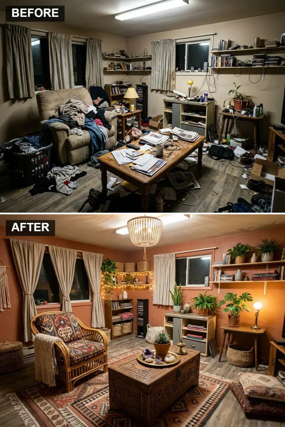
This is the direction I recommend for clients who love the Scandi discipline but can't live inside an all-white room. The wall color shifts from builder-beige to a warm terracotta — Farrow & Ball Red Earth No. 64 or BM Spiced Pumpkin 086 are the two I reach for, both warm without going orange. A curated String Pocket or HAY Mags shelf replaces the wall of closed storage — open shelving works here because it's edited, not stuffed. Lighting does the heavy lifting: a jute-or-beaded pendant from Serena & Lily, a floor lamp with a linen shade, and restrained string lights around the bookshelf — never ceiling-runs of LED strip. The seating mix is a rattan lounge chair (Sika Design "Teddy" or IKEA Buskbo) and a heavy carved-walnut coffee table, with a Moroccan wool rug grounding it. Keep the wood tones in the same warm family — walnut, teak, rattan, natural oak — and let the terracotta do the color work alone.
Color Palette
Color Spiced Terracotta
#B36B52
F&B Red Earth No. 64 or BM Spiced Pumpkin 086 — earthy warmth, not tangerine orange.
Accent Natural Rattan
#C49F78
Sika Design or IKEA Buskbo — organic texture that offsets heavy walnut.
Solid Walnut
#5C4033
Hand-carved or live-edge walnut; avoid veneer — the edge grain shows under direct light.
Cream Merino Wool
#F0EAD6
Chunky-knit throws in merino or Icelandic wool; skip polyester imitations — they pill by year two.
Styling Notes for This Look
- Swap the single overhead fixture for three or four warm light sources (2700K bulbs, CRI 90+). This is the single highest-impact Scandi move.
- Open shelving works only when it's edited. 60% styled objects, 40% breathing space — anything denser reads cluttered again.
- Keep all wood tones in one temperature family (warm or cool, not both). Mixing cherry with bleached oak is the most common boho-Scandi mistake I fix in client homes.
- A real Moroccan Beni Ourain rug ($1,800–$4,500) outperforms a synthetic reproduction ($200) in texture, patina, and how it photographs — worth the investment if the room is a keeper.
2. Coastal Breeze & Scandinavian Light
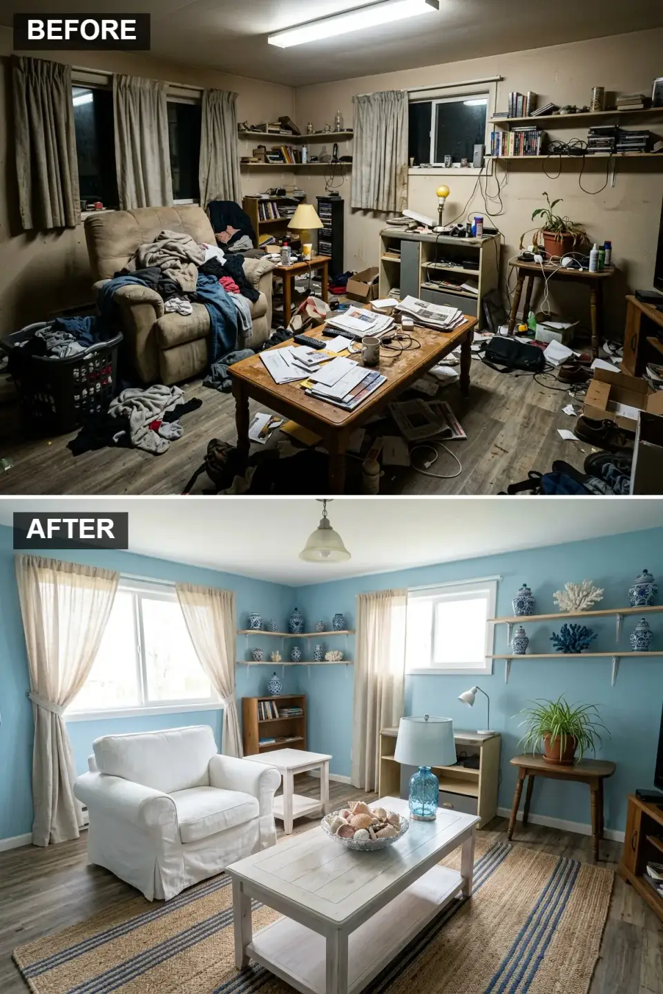
This is the easiest direction to execute well in the Lowcountry — Charleston, Kiawah, Daniel Island clients ask for it by name. Walls go BM Quiet Moments 1563 or F&B Borrowed Light No. 235 — those are the coastal blues that hold up in morning and evening light without turning nursery-pastel by noon. The heavy recliner becomes a Pottery Barn PB Comfort slipcovered armchair or an Article "Ceni" in linen; both wash and re-fit after Charleston summer humidity. The coffee table is a whitewashed solid oak or Serena & Lily Ericksson. A striped handwoven jute rug from Annie Selke or Dash & Albert grounds the composition. The ceramics are the detail that lifts this from generic coastal into Scandi-coastal — blue-and-white Japanese Imari, or contemporary Dansk, not decorative starfish. Skip nautical motifs entirely; they're the fastest way to push coastal toward "beach-house gift shop."
Color Palette
Color Coastal Sky Blue
#8FBED6
BM Quiet Moments 1563 or F&B Borrowed Light — the coastal blue that actually stays beautiful all day.
& Trim Crisp White
#FFFFFF
BM White Dove OC-17 on trim; slipcovers in washed linen or Belgian flax.
Whitewashed Oak
#E0D8CC
Solid oak with a chalk wash; avoid the gray driftwood finish — it reads dated by 2026.
Handwoven Jute
#C0A080
Annie Selke or Dash & Albert — natural jute sheds for 3 months then settles.
Styling Notes for This Look
- Slipcovers are non-negotiable if you live with kids, pets, or salt-air proximity. Washable is what keeps coastal Scandi from going grey by year three.
- Stick to a two-color palette (blue + white) and let texture do the variation — jute, linen, woven, ceramic, whitewashed wood.
- Natural-fiber rugs (jute, sisal, seagrass) read correct here; wool reads like a mistake.
- Swap any decorative "beach" object — shells, ropes, anchors — for something useful: a ceramic pitcher, a pottery lamp, a pile of actual books.
3. Rustic Cabin Cozy
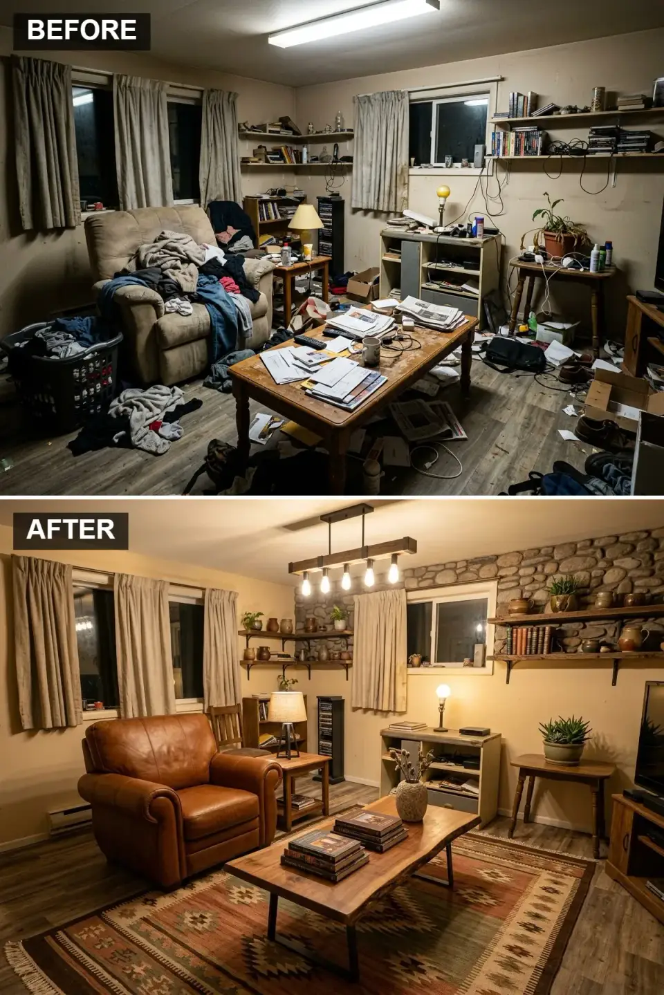
This direction is where Scandi meets "mountain-modern" — strongest for Asheville, Highlands-Cashiers, or Lake Lure clients, but it also lands in a Charleston primary-home if the client skews rustic-warm. The stone accent wall is the anchor: I specify Eldorado Stone Mountain Ledge in Rockwood or Boral Cultured Stone Country Ledgestone — 4-inch face thickness minimum, adhered with Type S mortar over ASTM C1063 metal lath per IRC R703 masonry-veneer requirements. Real stone costs $14–$28/sf installed; adhered manufactured stone runs $9–$16/sf. The armchair is the detail that does 40% of the work: a full-grain cognac leather piece like a Restoration Hardware Devon, Article "Sven" in charme tan, or Crate & Barrel Axis III. A live-edge acacia or walnut slab coffee table ($1,400–$3,800 for a real slab, not a veneered imitation) grounds the seating area. Pendant light goes industrial-warm — a Cedar & Moss Gatsby or Schoolhouse Isaac, with 2700K Edison filament bulbs.
Color Palette
River Stone Ledgestone
#807B73
Eldorado Mountain Ledge or Boral Country Ledgestone — natural colors span warm grey to brown.
Full-Grain Cognac Leather
#9E633B
Full-grain (not corrected-grain) leather — patinas over 5–10 years rather than cracking.
Live-Edge Acacia
#7A542F
Real slab — veneer chips at the edge. Finish with Osmo or hard-wax oil, not polyurethane.
Warm Cream
#F5F1E6
BM Muslin OC-12 or F&B Joa's White No. 226 — warm enough to play with leather and stone.
Styling Notes for This Look
- Real stone veneer ($14–$28/sf installed) beats thin adhered stone for durability and shadow-depth, but weight matters — confirm wall framing can carry 15+ psf before committing.
- A quality leather armchair ($1,800–$4,500) is a 20-year piece. Cheap bonded-leather ($400–$800) starts peeling by year three in humid climates.
- 2700K warm-white bulbs (CRI 90+) throughout — 3000K reads Scandinavian, 4000K reads commercial.
- Live-edge slabs: ask for the moisture content (8–10% is stable for interior) and finish with penetrating oil, not surface polyurethane, which yellows within 5 years.
4. Moody Maximalism with a Scandi Spine
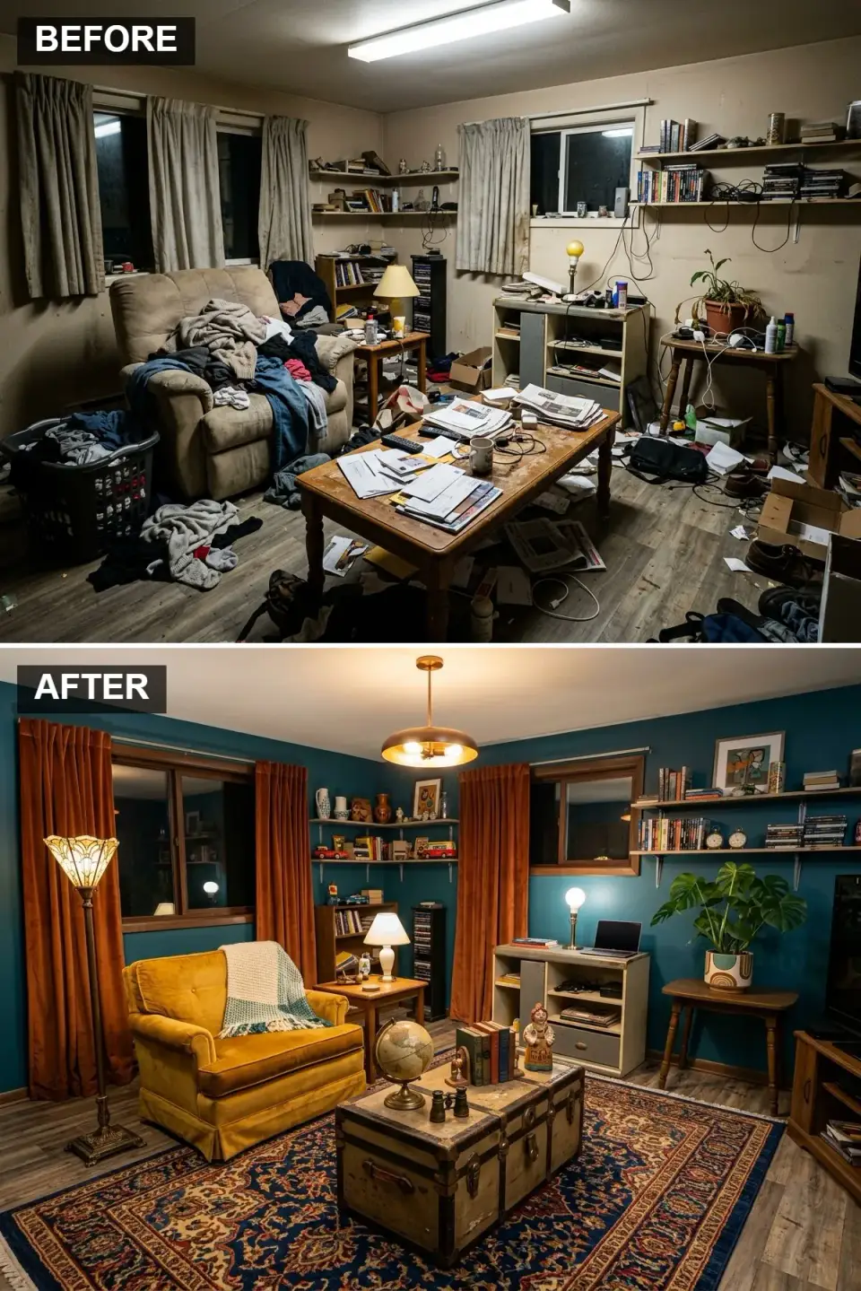
This is the direction clients try to talk me out of and then fall in love with once they see it rendered. Scandi's restraint and proportion underneath, maximalist color and texture on top. Walls go Farrow & Ball Inchyra Blue No. 289 or BM Knoxville Gray HC-160 — deep, saturated, moody but not black. The armchair is the focal point: a Velvet mustard or ochre lounge chair in Kvadrat Hallingdal or Maharam Mohair — Article "Ceni" in marigold or a vintage reupholstered MCM piece. Floor-to-ceiling rust-velvet or heavy linen curtains (Pottery Barn Belgian Linen, or custom Kvadrat at the high end) frame the windows and absorb the echo the dark walls create. The vintage trunk-as-coffee-table is the "collected" move that separates this from a hotel-lobby read — genuine vintage, not reproduction. Brass or patinated-aged-brass hardware on lamps and lighting (Schoolhouse, Cedar & Moss, or vintage Stilnovo) pulls the whole thing together.
Color Palette
Color Deep Teal
#004F59
F&B Inchyra Blue No. 289 or BM Knoxville Gray HC-160 — saturation without going black.
Mustard Velvet
#CCA300
Kvadrat Hallingdal or Maharam — commercial-grade performance velvet for real use.
Rust Velvet
#A04000
Custom in rust or terra-cotta velvet; Pottery Barn Belgian Linen in burnt sienna as budget alternative.
Vintage Trunk
#6B4F3B
Real vintage — a steamer trunk, a blanket chest, a tea caddy. The patina is the point.
Styling Notes for This Look
- Dark walls make small rooms feel intimate, not smaller. The biggest error is pairing them with white trim — go same-color trim (wall color carried onto trim) to let the room envelop you.
- Heavy velvet or linen curtains aren't decorative — they absorb acoustic echo, which dark walls amplify. Budget $800–$2,400 for real custom over ready-made.
- One bold accent piece in a jewel tone (emerald, mustard, sapphire, rust) is enough. Two is a room. Three is a showroom.
- Real vintage (1stDibs, Chairish, estate sales) reads collected. Reproduction trunks and "vintage-style" pieces read trying-too-hard.
5. The Japandi Sanctuary
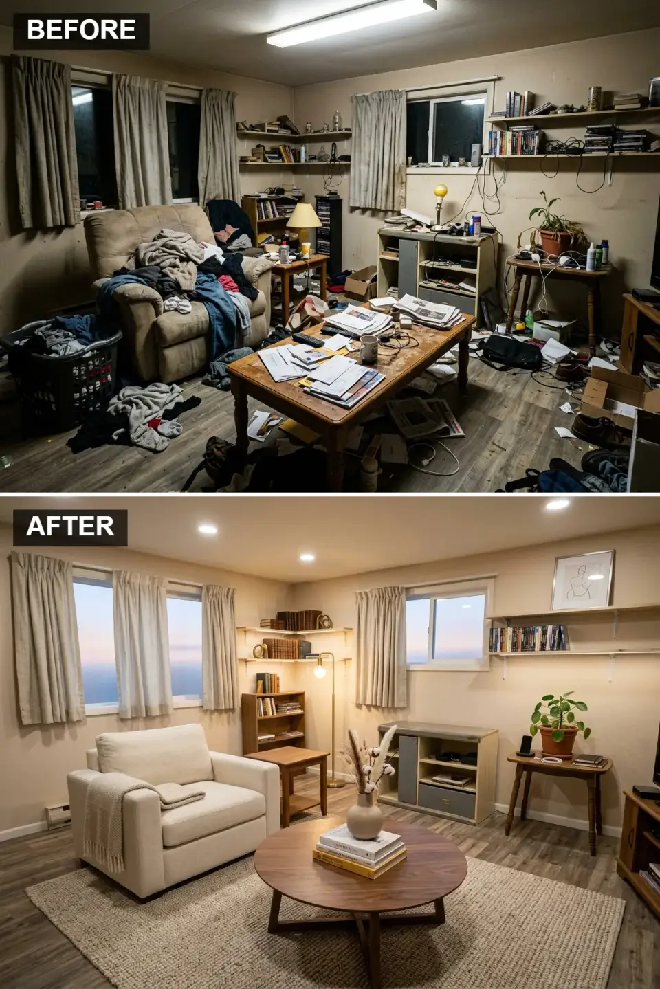
Japandi is Scandinavian functional minimalism meeting Japanese wabi-sabi — not a trend, a genuine aesthetic marriage tracing back to mid-century cross-pollination between Japanese craftsmen and Finnish/Danish designers. It's the direction I recommend for clients who want quiet as the room's organizing principle. Walls go F&B Slipper Satin No. 2004 or BM Simply White OC-117 in a matte or limewash finish. Furniture is radically edited: a single Menu (Audo) Harbour lounge chair in oatmeal Kvadrat linen, a Muuto Oslo sofa, or a Carl Hansen CH07 Shell chair. The coffee table is the statement — a round solid walnut drum like the Article "Mara" or a Ariake Drift (if you want real Japandi), with exposed joinery. Floor lamp is an Isamu Noguchi Akari 1A or a Muuto E27. Flooring reads warm oak, never laminate. No decorative clutter; one tokonoma-style arrangement — a single ceramic, a single branch, one book stack. The art is the absence of art.
Color Palette
Color Soft Paper Beige
#E3DAC9
F&B Slipper Satin No. 2004 or BM Simply White OC-117 in matte finish — a breathing-room neutral.
Oatmeal Belgian Linen
#D9D0C1
Kvadrat or Libeco Belgian linen — washed, not polished. The wrinkle is intended.
Solid Walnut Drum
#5C4033
Article "Mara," Ariake Drift, or a custom local maker — exposed joinery, not veneer.
White Oak (Natural Oil)
#C4A484
Rift-and-quartered white oak, penetrating-oil finish (Rubio Monocoat, Osmo). Not engineered click-lock.
Styling Notes for This Look
- Ruthless editing is the entire discipline. Keep a piece only if it earns its place — functional, loved, or genuinely beautiful. Storage goes behind closed doors.
- Furniture forms must be simple and honest — no distressed finishes, no ornate carvings, no cheap "live-edge" slabs with epoxy fills.
- One sculptural plant (olive, Japanese maple, Fiddle Leaf fig) or a dried branch in a heavy ceramic vessel. Never a cluster of small pots.
- Akari lamps (Isamu Noguchi, made in Gifu since 1951) are the canonical Japandi floor lamp — $350–$850 for the real thing, avoid the dozens of knockoffs.
6. Modern Scandi Essentials
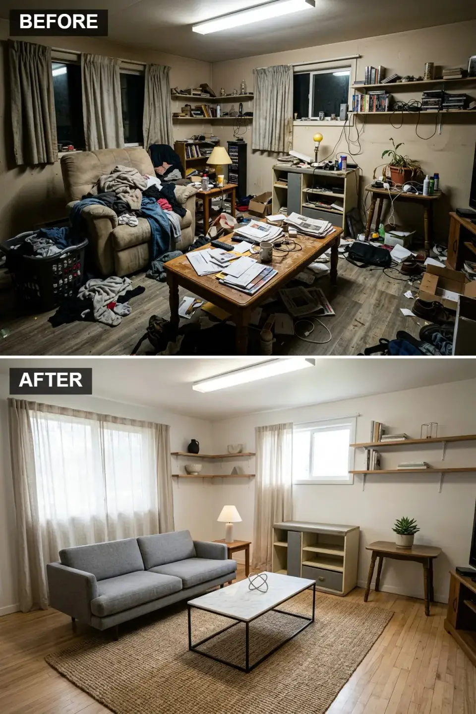
This is the textbook Scandi direction — and the most commonly requested version in clients under 40 in Charleston, Nashville, and Atlanta. Walls and ceiling go BM Simply White OC-117 (not pure white — it photographs cold). Flooring is wide-plank white oak with a natural oil finish. The sofa is what everything else answers to: HAY Mags, Muuto Outline, Article "Sven" in seasalt, or a Design Within Reach Bensen Neo — all in medium warm grey, feather-wrapped cushions. The coffee table is the hero: a real Carrara marble top on a matte-black powder-coated steel base, or the CB2 Smart Table or Muuto Around. Sheer linen curtains (not polyester!) on simple rod-mounted tracks filter the Charleston afternoon light. String Pocket or Muuto Stacked shelves in low density — eight to twelve objects per 6-foot span, no more. The entire palette is white, grey, warm oak, and black; the texture is the color.
Color Palette
Warm White
#FFFFFF
BM Simply White OC-117 or F&B Wevet No. 273 — warm enough to live with.
Medium Warm Grey
#808080
Muuto Outline, HAY Mags, Article "Sven" in seasalt — fabric, not leather.
Top Carrara Marble
#F0F0F0
Real Carrara — the veining is the point; quartz "marble-look" reads synthetic in natural light.
Base & Accents Matte Black Steel
#000000
Powder-coated black steel; avoid glossy finishes — matte is canonical Scandi.
Styling Notes for This Look
- A quality medium-grey fabric sofa ($2,200–$5,800) is the single-longest-lasting investment in a Scandi room. Specify feather-wrapped cushions over all-foam.
- Mix hard materials — marble, matte black steel, warm oak — without adding color. Texture is the variation.
- Sheer linen curtains (not polyester sheers, which look plastic) soften daylight and read Scandinavian. Budget $400–$900 per window.
- Seal real Carrara marble annually with penetrating sealer (StoneTech BulletProof) to manage water-ring staining — or accept the patina as part of the look.
7. Mid-Century Modern Revival
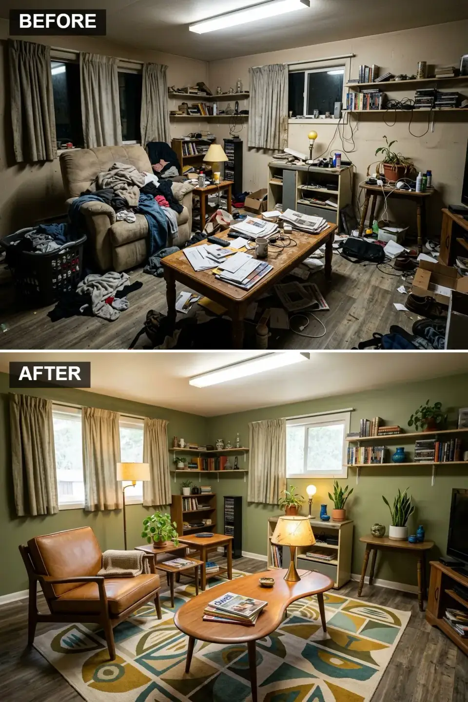
The Scandi-MCM overlap is genuine — Danish Modern from the 1950s and 60s is literally where today's "Scandi" vocabulary comes from. Arne Jacobsen, Hans Wegner, Finn Juhl, Poul Kjaerholm, Børge Mogensen — those designers are why we're still talking about tapered legs and teak joinery. Walls in this direction go F&B Bancha No. 298 or BM Dakota Shadow 2142-40 — a true olive, not sage. The canonical pieces are real or high-quality reissue: Hans Wegner CH25 or CH24 Wishbone lounger, a Niels Otto Moller armchair, or the Carl Hansen CH07 Shell chair. A genuine teak kidney-bean coffee table from the 1960s ($800–$2,400 on 1stDibs) or a reissue from Onecollection. A Designer's Guild or Vitra graphic-pattern rug in mustard and teal. Lighting is canonical too: a Nelson Bubble pendant, a Serge Mouille, or a Poul Henningsen PH5.
Color Palette
Color Olive Grove
#6B7A4E
F&B Bancha No. 298 or BM Dakota Shadow 2142-40 — a true olive, muted and retro.
Wood Danish Teak
#966F33
Real teak or rosewood; spec finishes with Osmo Wax or Danish oil to protect grain.
Tan Saddle Leather
#B07C4F
Full-grain saddle leather on a genuine Mogensen or Wegner reissue ($2,400–$8,500).
Accents Mustard & Teal
#D4AF37
Geometric-patterned wool; Designer's Guild or vintage Ege Axminster for authenticity.
Styling Notes for This Look
- Tapered legs and organic curves are the formal MCM signature. Avoid chunky or boxy replacements — they read contemporary-imitation rather than authentic.
- One large geometric rug anchors the seating. Multiple small rugs break up the open-plan quality this look depends on.
- Olive green + warm wood + mustard is the canonical MCM palette. Add teal sparingly as accent only.
- Genuine vintage MCM ($800–$8,500 per piece on 1stDibs, Chairish) reads differently from reproduction. If the budget supports it, one authentic piece per room is worth three reproductions.
8. The Essence of Hygge
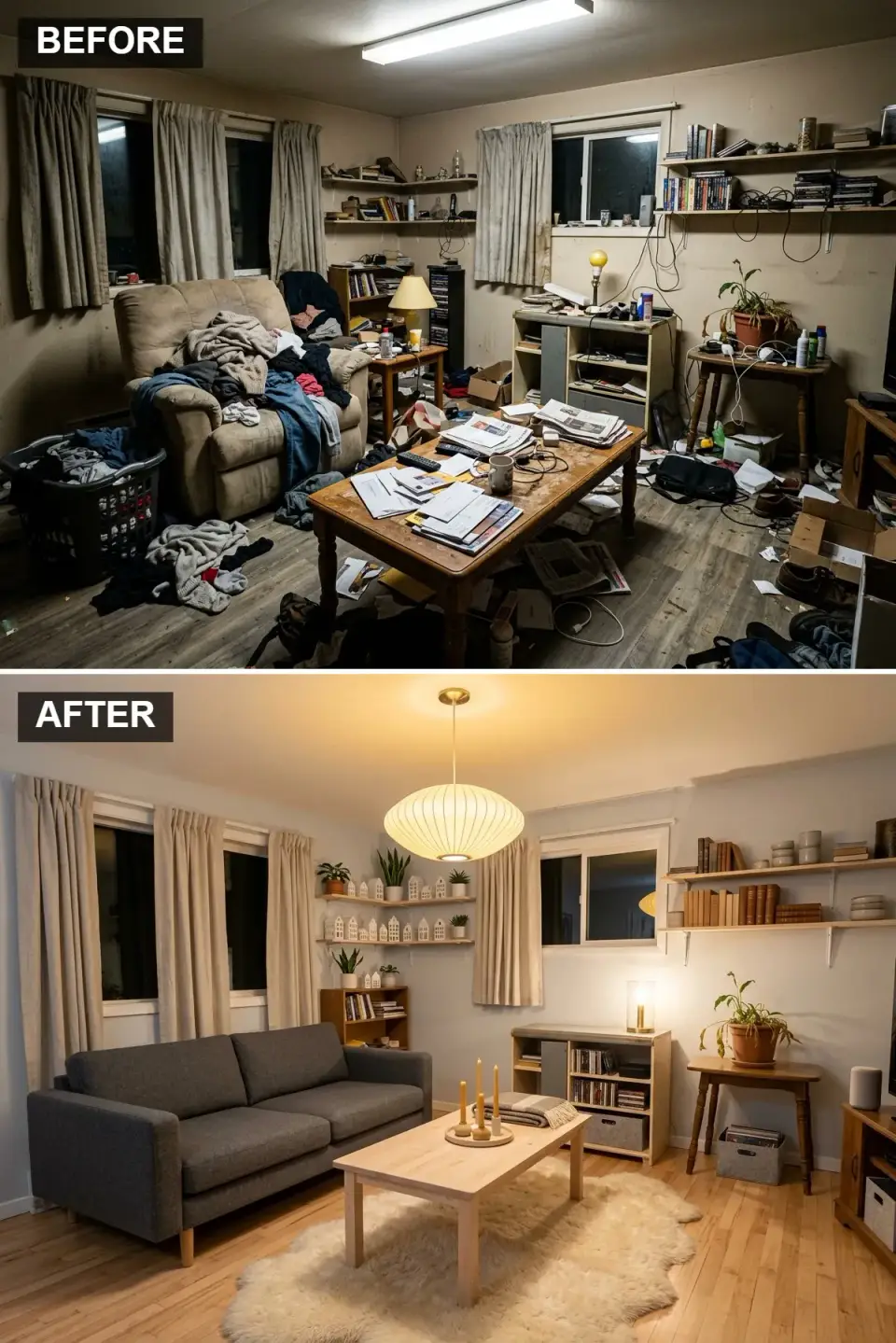
Hygge (pronounced "HOO-gah") is the Danish concept of contented, conscious coziness — it's not a style, it's an atmosphere. The directional move here is layered warmth: walls in F&B Skimming Stone No. 241 or BM Gray Cashmere 2138-60, a charcoal grey Gus* Modern Bloor or Article "Cigar" sofa, a blonde pine or solid-maple coffee table, and — critically — a cream Icelandic or New Zealand sheepskin rug layered over a larger wool or jute base. Lighting is the most important single move: a genuine Herman Miller Nelson Bubble pendant ($450–$900) or a Louis Poulsen PH5 casts the warm enveloping pool that defines hygge. Supplement with 3-wick beeswax or soy candles (Diptyque, Cire Trudon) — real candles, not LED imitations. A textured merino or alpaca throw draped on the sofa, a ceramic mug of coffee nearby, a single well-worn book stack. This is the direction clients from Minneapolis, Portland, and Boulder gravitate toward instantly.
Color Palette
Color Pale Mist Grey
#D0D0D0
F&B Skimming Stone No. 241 or BM Gray Cashmere 2138-60 — warm undertone, not blue.
Charcoal Grey Boucle
#404040
Boucle or heavy-weave performance fabric in charcoal; grounds the lighter envelope.
Blonde Pine
#E6D2B5
Solid pine or maple with wax finish — the light-wood note that lifts the grey.
Layer Cream Icelandic Sheepskin
#FDFBD3
Real Icelandic sheepskin ($180–$450) holds up better than New Zealand or synthetic.
Styling Notes for This Look
- Layer rugs — a real Icelandic sheepskin over a flat-weave wool or jute base. The texture contrast is what makes hygge hygge.
- Lighting strategy matters more than furniture: multiple 2700K sources, no overhead fluorescent, candles in real use.
- A designated cozy corner (not the whole room) — one armchair, a reading light, a throw, a side table. Hygge is a destination within the room, not the whole room.
- A Herman Miller Nelson Bubble pendant ($450–$900) is the genuine article; the $60 Amazon copies are noticeably different in translucency and proportion.
9. Industrial Loft Vibes
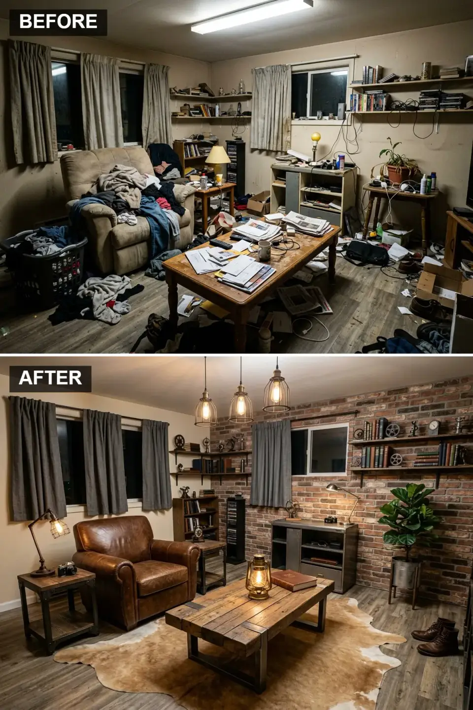
Industrial-Scandi is where the clean-lines discipline of Danish modernism meets the raw materiality of factory conversions — the Brooklyn loft aesthetic filtered through Copenhagen restraint. The brick accent wall can be genuine (exposed masonry in an older structure) or a high-end Brick Veneer Panel System or Stone Selex UltraLight. If it's not real brick, specify a 3/4-inch face depth and hand-tooled mortar joints — anything thinner reads as wallpaper at 6-foot view distance. The armchair is a full-grain distressed brown leather like a Restoration Hardware Maxwell or Crate & Barrel Axis in nitro leather — the distressing is authentic patina, not factory-rubbed. Coffee table is solid reclaimed wood over black steel I-beam legs — Four Hands, West Elm Industrial, or custom local fabricator. Lighting is the definer: Schoolhouse Factory, Cedar & Moss Gatsby, or authentic vintage industrial cage pendants with 2700K Edison-style LED bulbs (not incandescent — the heat shortens bulb life).
Color Palette
Reclaimed Brick Red
#9C5942
Real exposed masonry or 3/4-inch brick veneer; avoid paint-on-drywall brick patterns.
Distressed Leather
#5C3A21
Full-grain nitro or saddle leather; hand-rubbed patina, not factory distressing.
Raw Black Steel
#363636
Hot-rolled or powder-coated matte-black steel; table bases, pendant hardware, window mullions.
Charcoal Linen
#4F4F4F
Heavy-weave linen or Belgian flax in dark charcoal; pleated headers, floor-length.
Styling Notes for This Look
- Real brick or minimum 3/4-inch veneer — thinner adhered panels read as wallpaper under raking light.
- Edison-style LED filament bulbs (not incandescent) at 2700K — the heat from real incandescent shortens the lifespan of vintage-style fixtures.
- Mix raw wood and raw steel 50/50; anything more wood reads rustic, anything more steel reads warehouse.
- A single iconic piece of industrial art — a reclaimed factory clock, a salvaged industrial sign, a framed blueprint — grounds the room without becoming Pinterest-cliché.
10. Luxurious Scandi Glam
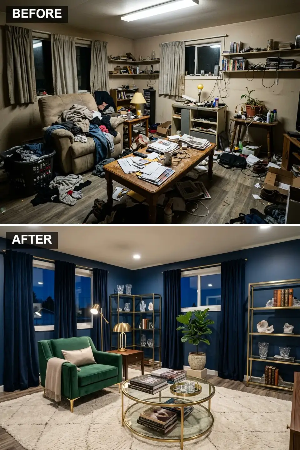
This is the direction clients in Buckhead, Charlotte's Myers Park, Nashville's Belle Meade, and Naples' waterfront estates gravitate toward — Scandi bones with high-glam finishes. Walls go F&B Railings No. 31 or BM Hale Navy HC-154 — saturated navy that reads near-black under evening light. The armchair is the showpiece: an emerald velvet Roll & Hill, Arhaus Kipton, or custom upholstered Bernhardt in Kvadrat Pure Emerald. Polished brass or aged-brass hardware throughout — Visual Comfort Thomas O'Brien, Circa, or Hudson Valley Lighting. Coffee table is glass over brass or a marble-top with brass-gilt base — Made Goods, Oly, or Bernhardt. A plush ivory or cream pile rug (8-foot minimum depth pile) grounds the dark walls. Artwork frames in gold leaf or polished brass, not black. This is Scandi restrained composition with the volume turned up — one or two jewel-tone pieces, rich texture, metallic accent, never more.
Color Palette
Color Deep Navy
#000033
F&B Railings No. 31 or BM Hale Navy HC-154 — saturated without pure black.
Emerald Velvet
#005940
Kvadrat Pure Emerald or Maharam — performance velvet for real-life durability.
Polished / Aged Brass
#D4AF37
Visual Comfort, Circa, or aged-brass bespoke — the darker patina reads more considered.
Ivory High-Pile Wool
#F8F8F8
8-inch wool pile over a jute base; avoid synthetic shag — it matts and yellows.
Styling Notes for This Look
- Dark walls in a luxury room should go wall-and-trim the same color — contrasting white trim pulls the room backward into traditional.
- Brass accents require consistency: choose polished OR aged-brass OR nickel — mixing metals in a glam room reads uncommitted.
- One jewel-tone accent (emerald, sapphire, ruby velvet). Two starts to feel like a bar. Three is a hotel lobby.
- Sealed engineered wood flooring (Stuga, Carlisle, or Mirage) in mid-tone oak or walnut is the right floor for this direction — lighter oak fights the drama.
11. Zen Minimalism with Negative Space
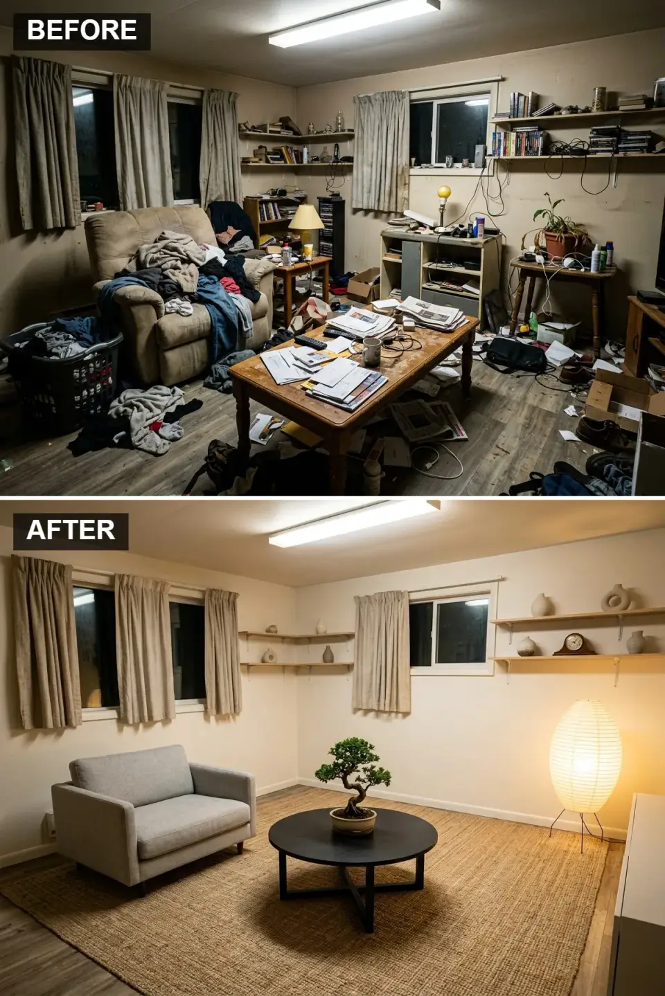
This is the most disciplined direction in the entire set — what Scandi actually is underneath all the stylistic variants. Walls go F&B Wevet No. 273 or BM Chantilly Lace OC-65 at 20% saturation (a soft off-white, not pure). Flooring is wide-plank white oak, rift-and-quartered, penetrating-oil finish. Furniture is aggressively minimal: a small Muuto Outline two-seat settee, a single low matte-black steel coffee table from HAY or DWR, and a large natural sisal rug that defines the zone. The focal point is a single bonsai (real, not silk) — a Japanese black pine or Juniperus procumbens, placed on a low pedestal with a simple Noguchi Akari 1A paper lantern providing ambient light. That's the entire room. Done correctly, the negative space reads as a deliberate design choice — like a well-composed photograph where the empty areas carry as much weight as the subject. Done poorly, it reads as "not finished yet."
Color Palette
Soft Off-White
#F2F2F0
F&B Wevet No. 273 — barely-there, breathing, not clinical.
#B0B0B0
Kvadrat Divina or Hallingdal — natural heather grey, feather-wrapped cushions.
Matte Black Steel
#1A1A1A
HAY Kofi or DWR Min — low-profile, no ornamentation, single visual anchor.
Natural Sisal
#C9B292
Large-scale 9x12 or 10x14 sisal defines zone; boundaries without color.
Styling Notes for This Look
- Negative space is the hardest design principle to execute well — remove until the room feels "wrong," then remove one more thing. That's usually right.
- A single focal object (bonsai, sculpture, ceramic vessel) must be strong enough to carry a room by itself. A cheap specimen won't do the work.
- Large-scale rug (minimum 9x12 in an average living room) anchors the whole composition — small rugs read as an afterthought.
- This direction photographs flat unless lighting is intentional — a Noguchi Akari 1A, a Foscarini Twiggy, or a Verner Panton Flowerpot casts the soft shadow that gives depth.
Pro Tips I Give Every Scandi Client
- Define your palette before you shop. Three to five colors committed to paper. Every purchase has to earn its place inside those colors — this one rule prevents 80% of the "my room doesn't feel cohesive" problems I'm called to fix.
- Light is a design material, not an afterthought. 2700K bulbs, CRI 90+, multiple sources, no single overhead reliance. I spec three to five light sources per room minimum — floor lamp, table lamp, pendant, wall sconce, and candlelight for evening.
- Declutter before you shop. If you start a Scandi project by buying a new sofa, you will end it by still having too much stuff. Empty the room first. Then re-introduce deliberately.
- Invest in one hero piece per room. A real Wishbone chair, a real Muuto sofa, a real Nelson Bubble pendant. Everything else in the room can be IKEA, but the hero is the pole the room is pitched around.
- Texture carries the variation when color is restrained. Linen, wool, boucle, leather, jute, stone, oak, walnut, marble, matte steel. Mix at least five textures in any Scandi room — that's what keeps it from reading flat.
- Quality over quantity, every time. Two beautiful well-made pieces outperform ten okay ones. Scandi discipline is noticing the difference between $1,800 for one chair and $200 for nine things.
- Never use 4000K or 5000K bulbs in a residential room. That's commercial/office light. Warm white (2700K) reads Scandinavian; anything cooler reads like a hospital.
Regional Fit & Climate Notes
- Charleston / Mount Pleasant / Savannah: Directions 2 (coastal Scandi), 5 (Japandi), and 6 (modern Scandi essentials) read most native. Specify performance fabrics (Crypton, Sunbrella, Kvadrat) to survive Lowcountry humidity and salt air.
- Nashville / Asheville / Mountain Southeast: Directions 3 (rustic cabin), 7 (MCM revival), and 9 (industrial loft) align with the design-forward custom work trending in these markets.
- Atlanta / Charlotte / Myers Park / Buckhead: Directions 6 (modern Scandi), 10 (Scandi glam), and 11 (zen minimalism) fit the urban-sophisticated client profile. Direction 10 especially resonates in established luxury neighborhoods.
- Naples / 30A / FL Gulf Coast: Direction 2 (coastal Scandi) is home-field. Direction 10 (Scandi glam) works in waterfront estates. Avoid dark-wall directions (4, 10) facing direct sun unless windows are tinted — fade is aggressive at those latitudes.
- Austin / Hill Country TX: Directions 1 (boho-Scandi), 3 (rustic), 5 (Japandi), and 9 (industrial) all land in Austin's design-forward neighborhoods. Direction 5 Japandi has exploded in East Austin specifically.
- Minneapolis / Portland / Denver / Seattle: Direction 8 (hygge) is canonical here — cold-climate Scandi is the indigenous language. Directions 5, 6, and 11 also fit.
- Phoenix / Scottsdale / Palm Springs: Directions 5 (Japandi), 6 (modern Scandi), and 11 (zen minimalism) work best — the clean-line discipline pairs with desert modernism. Avoid heavy dark-wall directions; the heat load compounds.
Frequently Asked Questions
Do I have to paint every wall white for a real Scandi look?
No — and this is the single biggest misconception clients bring into Scandi projects. Authentic Scandinavian interiors use saturated color as readily as they use white; the discipline is in restraint of quantity, not in elimination of color. Directions 1 (terracotta), 2 (sky blue), 4 (deep teal), 7 (olive green), and 10 (navy) in this set are all genuine Scandi directions. What matters is choosing one saturated wall color and staying committed to it, rather than drifting into two or three.
What's the difference between Scandi and Japandi?
Scandi is a broad Northern European design vocabulary built on functionality, light, and restrained palette — with roots in 1930s–60s Danish, Finnish, and Swedish design. Japandi is specifically the fusion of Scandinavian function with Japanese wabi-sabi aesthetics — the imperfect, asymmetric, weathered, handcrafted quality. Japandi emphasizes even tighter editing, warmer wood tones (more walnut than oak), natural organic shapes, and low-profile furniture. Direction 5 in this set is Japandi; Direction 6 is classic Scandi.
How much does a full Scandi living room transformation cost?
For a 200–300 sq ft living room, a full Scandi transformation — paint, hero sofa, coffee table, armchair, rug, lighting, shelving, window treatments, and styling objects — runs $8,500–$42,000 depending on tier. The budget tier uses IKEA + Article + Target + Benjamin Moore Regal Select ($8,500–$15,000). The investment tier uses HAY + Muuto + DWR + F&B Estate Emulsion + Visual Comfort lighting ($25,000–$42,000). In Charleston and Austin I see most real-client budgets land in the $14,000–$22,000 range.
Can I mix Scandi with my existing traditional furniture?
Yes — and a thoughtful mix often reads better than pure Scandi. A Wegner CH25 lounge chair in an otherwise traditional room reads "considered." A traditional Persian rug under modern Scandi furniture reads "collected." What doesn't work is random traditional pieces next to random Scandi pieces without a unifying thread — usually color or wood tone or scale. The mix works when one language is dominant (70%) and the other is accent (30%).
What's the biggest Scandi mistake clients make without realizing?
Three, tied for first place: (1) cool-white lighting (4000K/5000K bulbs, which reads commercial, not Scandinavian), (2) mixing too many wood tones from different temperature families — warm cherry next to cool white-washed oak next to walnut — which reads scattered rather than layered, and (3) over-filling shelves. A Scandi shelf should be 40% empty space. When it's packed edge-to-edge with objects, you've recreated the clutter the makeover was supposed to solve.
Do I need a Herman Miller Nelson Bubble or can I get a copy?
You can tell the difference at 10 feet. The real Herman Miller Nelson Bubble ($450–$1,200) uses a specific polymer shade with UV-stable pigment and precise diffusion geometry that produces the soft warm glow it's famous for. The $60–$120 Amazon copies use thinner, whiter plastic that reads colder and more translucent-fluorescent at night. If you can only afford one investment lighting piece in a Scandi room, make it the Nelson Bubble or a Poul Henningsen PH5 ($850–$1,400) — those two fixtures carry a room. Everything else can be IKEA.
Does Scandi design work in small spaces?
Scandi design works especially well in small spaces — it's where the style originates (cramped Copenhagen apartments, not Texas McMansions). The principles of clean lines, light colors, maximized natural light, and ruthless editing are tailor-made for rooms under 250 sq ft. In a small room I'd push harder toward Directions 5 (Japandi), 6 (modern Scandi), or 11 (zen minimalism) — these three handle small square footage better than the maximalist-leaning Directions 4 or 10.
How long does a Scandi transformation take?
A paint-plus-furniture-swap transformation takes 4–8 weeks start to finish — 1 week to confirm palette and source materials, 1 week for painting and furniture delivery coordination, 2–4 weeks for custom pieces (sofa, window treatments) that lead-time out, and 1–2 weeks for styling and final edit. If you're doing flooring (to white oak, for example) add another 3–5 weeks. Rushing compresses to 3 weeks but usually produces a half-finished result.
Sources & References
- Gram, Magnus. Scandinavian Design: Alternative Histories. Bloomsbury Visual Arts, 2020.
- Fiell, Charlotte and Peter. Scandinavian Design. Taschen, 2017 edition.
- Wiking, Meik. The Little Book of Hygge: Danish Secrets to Happy Living. William Morrow, 2017.
- Englander, Katja. Japandi Living: Japanese Tradition. Scandinavian Design. Gestalten, 2021.
- International Code Council. International Residential Code (IRC) 2021 — Chapter R703 (Wall Covering) for masonry-veneer accent-wall requirements. ICC Publications.
- ASTM International. ASTM C1063 — Standard Specification for Installation of Lathing and Furring. ASTM, 2021.
- Benjamin Moore & Co. "2024 Interior Color Specification Guide — Classic Collection and Historical Collection." Benjamin Moore, 2024.
- Farrow & Ball Ltd. "Estate Emulsion Color Card and Modern Emulsion Specification Guide." Farrow & Ball, 2024.
- Illuminating Engineering Society. IES Lighting Handbook, 10th Edition — residential lighting recommendations, CRI, and color temperature guidance. IES, 2020.
- Kvadrat A/S. "Performance Upholstery Fabric Durability Specifications — Hallingdal, Divina, Remix." Kvadrat Technical Documentation, 2024.
- Herman Miller, Inc. "Nelson Bubble Lamp — Design and Manufacturing History." Herman Miller Archives, George Nelson Collection.
- Carl Hansen & Son. "Hans J. Wegner Chair Collection — CH24 Wishbone and CH25 Lounge Specifications." Carl Hansen, 2024.
- Louis Poulsen. "Poul Henningsen PH5 Specifications and Lighting Design Principles." Louis Poulsen, 2024.
- Restoration Hardware. "Leather Grade Classification Guide — Full-Grain, Top-Grain, and Bonded Leather Differentiation." RH Technical Specifications, 2024.
- Author's consulting notes — 2019–2024 Charleston, Savannah, Nashville, Atlanta, Austin, Naples, and Asheville residential styling projects.
Final Thoughts
Eleven Scandi-family directions on one starting room isn't a menu — it's a discipline exercise. The point is that "Scandi" isn't a single look; it's a design language with dialects, and the dialect you choose should answer to your climate, your existing architecture, your collection of things you've actually lived with, and how the room needs to feel at 7 AM versus 8 PM. A white-box minimalist room in a historic Charleston single house misses the conversation the architecture is having; a moody maximalist room with dark walls in a 900 sq ft condo creates claustrophobia. The match between direction and context is 70% of the project's success.
If you want to see how the same "same-room, many-directions" approach plays out with different starting conditions, the twelve-transformation living room revival and the ten-direction dream-space study both use the same framework on different base rooms. For a broader styling study that crosses room types, the ultimate eleven-transformation room reveal covers a wider range of direction languages. And if you're stuck on the bedroom instead, the eleven-makeover spare-room series runs the same discipline on secondary spaces where the rules shift slightly. The common thread across all of these is the one idea I keep returning to with clients: the room you're trying to fix isn't a design problem — it's a decision problem. Narrow the language first, and everything else falls into place.
— Johan Martez, Charleston, SC

Elise Marchetti
Transformations Editor · Charleston, South CarolinaBefore-and-after projects with the invoices attached. Elise runs the Transformations desk — interiors, exterior facades and outdoor spaces across the Lowcountry and the wider South — and writes up what actually changed, what it cost, and which three decisions moved the room.
More from Elise →
Reader notes