


Over seven years of Charleston and Low Country consultations, I've watched the same builder-grade starting point — beige walls, a wire closet rod, a hollow-core door, a ceiling fan whose blades don't match anything — get built in very different directions depending on whose room it is. This portfolio walks through eleven distinct finishes applied to that exact starting room. It isn't a trend list or a style sampler. It's a set of honest readings of which style actually fits which household, what each one costs to execute properly, and where each one tends to fall apart if you aren't paying attention to lighting temperature, textile acoustics, and the specific way Southern light behaves from 7am to 7pm.
Contents
- Rustic Farmhouse Retreat
- Serene Japandi Sanctuary
- Dramatic Moody Glamour
- Sleek Modern Minimalism
- Bright & Airy Scandi-Boho
- Textured Organic Modern
- Emerald Art Deco Elegance
- Rugged Industrial Loft
- Vibrant Mid-Century Modern
- Cozy Boho Maximalist
- Opulent Vintage Hollywood Glam
- Pro Tips From Seven Years of Client Bedrooms
- Frequently Asked Questions
- Sources & Further Reading
- Final Thoughts
Rustic Farmhouse Retreat
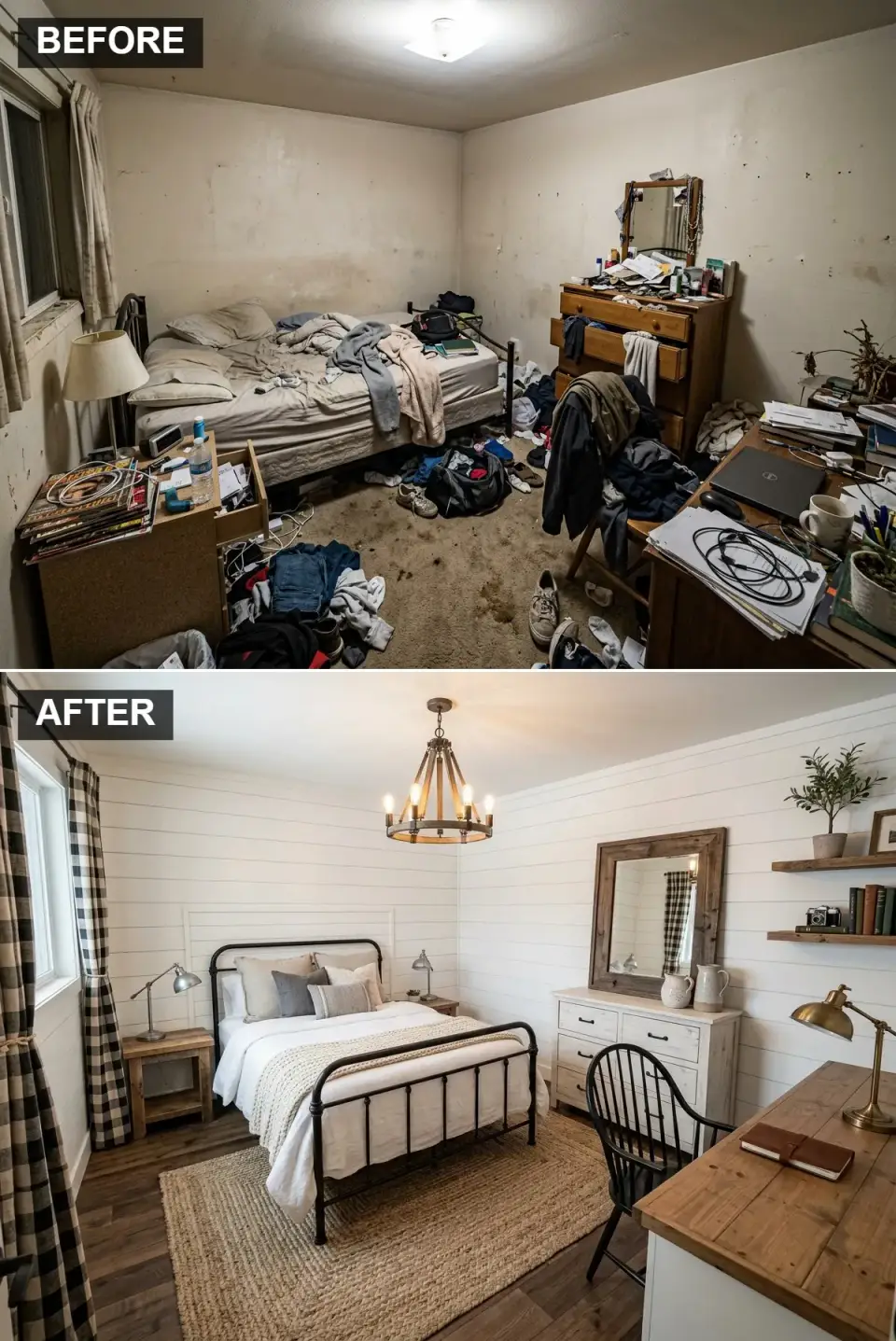
Farmhouse is the default opener for roughly half of my Mount Pleasant and Summerville intake calls, and for honest reasons: vertical shiplap behaves well under Low Country window light, and a black metal bed frame photographs respectably in a guest room, a child's room, and a primary simultaneously. The version shown here — jute underfoot, a wagon-wheel-adjacent ceiling fixture, rustic pine case goods — is the most forgiving of the eleven builds. It absorbs a lot of weekly mess gracefully, which matters when the room doubles as a Saturday-morning pancake-and-laptops zone. What it does not do is feel particularly quiet; the hard black metal and exposed wood surfaces keep the room slightly brighter acoustically than a softer palette would.
Color Palette
White Shiplap
#F0F0EB
A soft warm white that avoids the blue tip of builder-grade semi-gloss.
Matte Black
#2C2C2B
Matte, not gloss — the gloss finish shows every fingerprint.
Rustic Pine
#A68B6C
Warm natural tone; avoid the orange undertone that cheap pine tips toward.
Natural Jute
#C0A98E
Earthy texture under the bed; layer a smaller wool rug on top for softness underfoot.
Styling Notes for This Look
- Run the shiplap vertically, not horizontally, to pull the eye upward in a standard 8-foot ceiling.
- Weight the bed frame in matte black to anchor the palette against the pale walls.
- Layer a small wool rug over the jute rather than replacing the jute — the two textures together read as lived-in rather than staged.
Serene Japandi Sanctuary
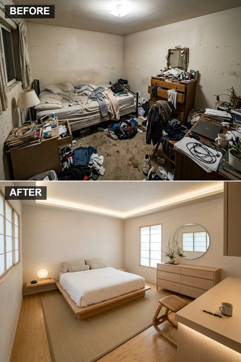
Japandi is the interior-design version of a long exhale, and I build it most often for clients in public-facing roles — ER nurses, hospital chaplains, courtroom attorneys — who need the bedroom to be the one place the day doesn't follow them. The low platform bed drops the visual weight of the room by about a third, the pale ash case goods keep it from tipping into sterile, and the indirect cove lighting replaces a single overhead fixture that was doing too much work. Caveat for actual use: if this bedroom doubles as a reading room, budget for a proper task lamp at the bedside. Cove light alone is too diffuse for serious reading past 10pm, and the wrong fix — a brighter overhead — breaks the entire scheme.
Color Palette
Off-White
#EFECE1
Warm off-white; test a sample under both morning and evening light before committing.
Light Ash
#D3C2A8
Blonde wood with a visible open grain; closed-grain ash reads flat.
Beige Tatami
#CDC6B0
Inspired by traditional Japanese tatami; a flat-weave wool in this tone works equally well.
Accent Warm Glow
#FFF3E0
2400K–2700K only; anything cooler breaks the scheme within an hour of dusk.
Styling Notes for This Look
- Keep the bed 12–14 inches off the floor, no taller. Standard bed heights fight the horizontal calm this look depends on.
- Swap any cool-temperature overhead fixture for a dimmable wall sconce at 2700K or below.
- Limit living material to one plant — not six — and leave at least one surface completely empty. The empty surface is the design.
Dramatic Moody Glamour
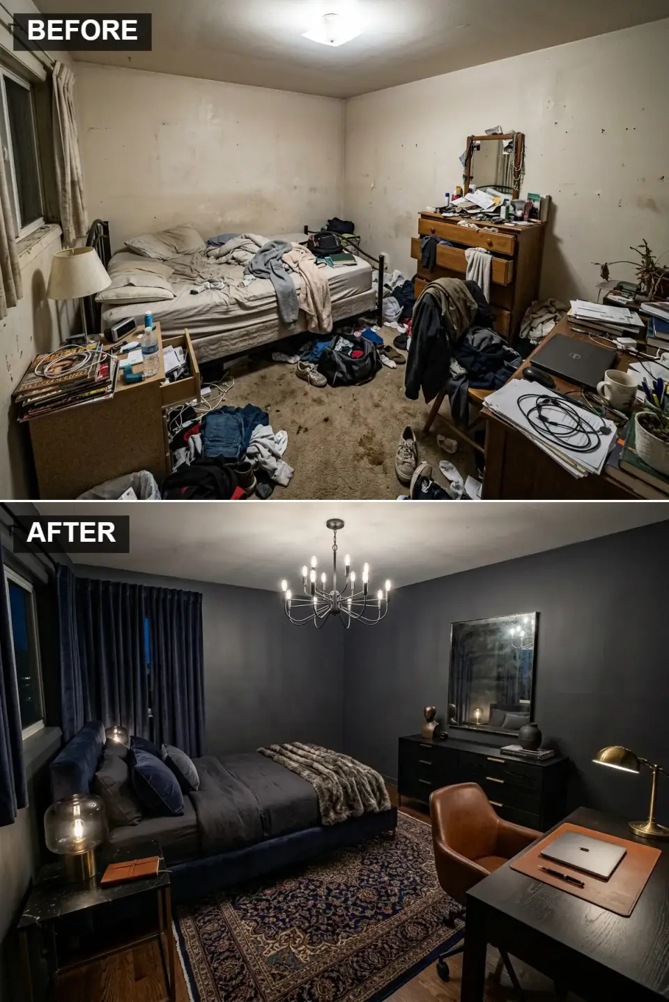
Dark walls are the single most misunderstood decision in residential bedroom design. Clients routinely assume they'll shrink the room; executed correctly, they do the opposite — they remove the walls as a boundary and let the room read as volume rather than surface. The deep charcoal here, paired with a navy velvet headboard and aged brass hardware, reads as a cocoon rather than a cave. The critical variable is bulb temperature: a 3000K+ lamp in a charcoal room turns it blue and clinical within seconds. 2400K–2700K is the only palette that lets the dark pigment perform the way it's drawn to. I had a Charleston client paint over a $5,000 charcoal scheme because she hadn't swapped the bulbs; we changed the bulbs, and the room the paint had always been trying to be finally showed up.
Color Palette
Deep Charcoal
#363A3F
Commit to the whole envelope — walls and ceiling both, not walls alone with a white ceiling.
Navy Velvet
#1B264F
Real velvet, not polyester velour — the latter pills within six months of weekly use.
Espresso Wood
#4A3B33
Dark stain on solid hardwood; veneer reads brittle against heavy wall pigment.
Aged Brass
#B59E5F
Aged, never lacquered-new. New brass reads as a prop.
Styling Notes for This Look
- Swap every cool-white bulb in the room to 2400K–2700K before the paint finishes curing. The finished room is the paint plus the light, not the paint alone.
- Choose brass hardware over chrome or nickel; chrome fights dark walls every time, and nickel goes flat.
- Layer rich textures — velvet on the bed, wool on the floor, a heavy lined curtain — or the dark pigment reads one-note.
Sleek Modern Minimalism
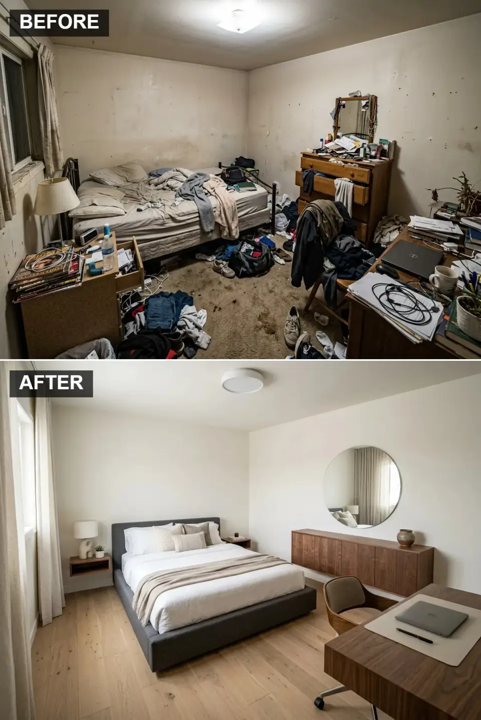
This is the version I build least often, because most clients underestimate the discipline it requires. Floating furniture is beautiful only if the walls behind it are cable-free, which means the electrical has to be planned at framing stage — retrofitting a floating credenza over an existing outlet is a $1,800 drywall surgery I've written three invoices for and won't write again. The large round mirror reads correctly only when ceiling heights are above nine feet; below that, it looks like a dinner plate hung too high. And the upholstered bed needs to be a deliberate charcoal, not black; true black photographs as a hole in the room and absorbs all the light the palette was supposed to distribute.
Color Palette
Pure White
#FFFFFF
A crisp flat white that refuses to yellow under warm lamps.
Charcoal Grey
#5A5E63
Charcoal, not black — the cooler tone reads present rather than absent.
Medium Walnut
#8C6A4B
One warm wood element is non-negotiable; without it, minimalism tips into clinical.
Light Oak
#C9B294
Wide plank, matte finish. Gloss reads dated within three years.
Styling Notes for This Look
- Run the electrical for floating nightstands and credenzas into the wall at framing stage, not as a retrofit.
- Keep the palette to four values maximum. Adding a fifth always costs the composition.
- If ceilings are under nine feet, choose a wide, low mirror over a round one. The round mirror needs height to read right.
Bright & Airy Scandi-Boho
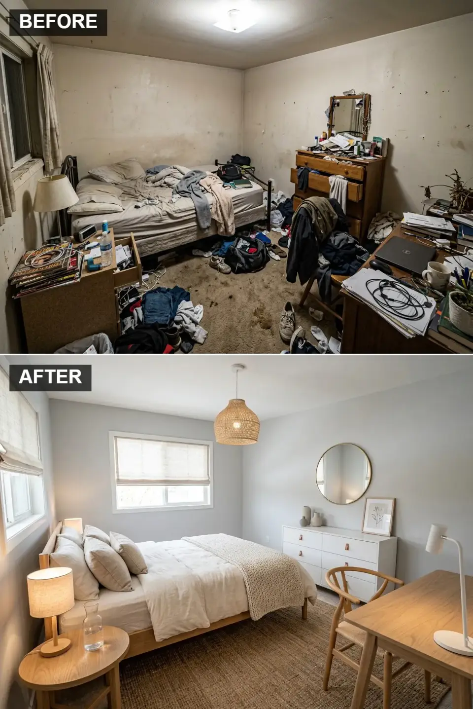
Scandi-Boho works in the Southeast when it leans more Scandi than Boho — our humidity doesn't flatter sisal over long summers, and hollow rattan chairs warp by year three. The pale mist wall color here holds its cool tone under both morning and afternoon Charleston light, where a true white tips yellow by four in the afternoon. The woven pendant is an honest choice; the test is to pick it up at the store and feel its weight. Genuine rattan is surprisingly heavy, and it darkens handsomely over time; synthetic rattan reads light in the hand and dusty after eighteen months. The single most common mistake I see is buying the discount version of the lighting to stretch the budget into more textiles. Reverse the priority. Lighting is the room.
Color Palette
Pale Mist Grey
#E0E5E9
Cool-leaning neutral that holds under both cloudy and bright Southern light.
Light Oak
#D8C19F
Blonde Scandinavian oak with visible grain; matte finish, never lacquered.
/Rug Natural Rattan/Jute
#C8AD8D
Real material, not synthetic — the aging difference is visible at year two.
Crisp White
#FAFAFA
Linen, not cotton. Linen wrinkles correctly; cotton reads cheap over time.
Styling Notes for This Look
- Source rattan and jute from specialty suppliers, not fast-home retailers. The year-two difference is immediately visible.
- Linen bedding, not cotton. Linen ages into the look; cotton ages out of it.
- Keep patterned textiles to the rug alone. Everything else — bedding, curtains, pillows — stays solid.
Textured Organic Modern
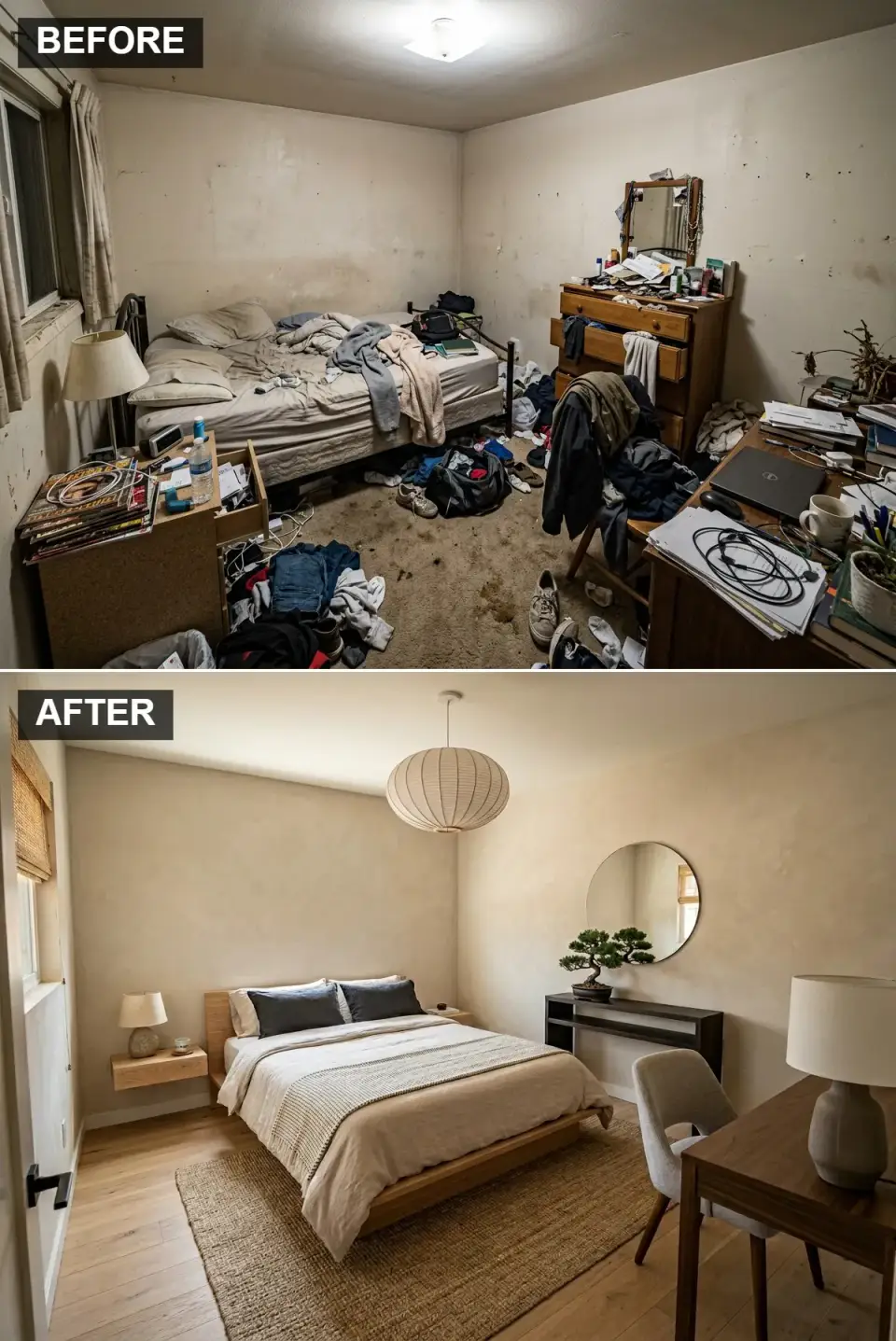
Limewash is having a deserved moment. A properly applied limewash wall has depth no paint can replicate, because it's actually three tones dragging across each other as the mineral pigment settles. The caveat for Charleston, Summerville, and anywhere else humidity climbs past 80% for weeks on end: limewash over drywall requires a compatible primer and skilled application, and a DIY attempt in Low Country summer will fail in ways you'll see within six months. I've retrofitted three of these for clients who tried it themselves — the pigment bloomed unevenly, the edges grew mold lines, and the only fix was a full prime-and-repaint. Pay the specialist the first time. The difference between a good limewash and a bad one is the difference between the room in the photograph and the room you'll have to repaint.
Color Palette
Beige Limewash
#D0C5B4
Textured mineral finish; soft movement, never flat.
Natural Walnut
#8D6E52
Visible live edge or a knot is the whole point — the imperfection is the design.
Woven Seagrass
#AFAF98
Another layer of organic texture; skip if the floor runs cold in winter.
Matte Black
#222222
Grounding contrast for lamp bases and hardware — matte only, never gloss.
Styling Notes for This Look
- Hire a trained limewash applicator — this is not a DIY move in Southern humidity.
- Select a walnut console with a visible live edge or a pronounced knot. A clean-edge board fights the whole premise.
- Keep decor to three singular objects, at least one of which is living — bonsai, olive tree, or a single orchid.
Emerald Art Deco Elegance
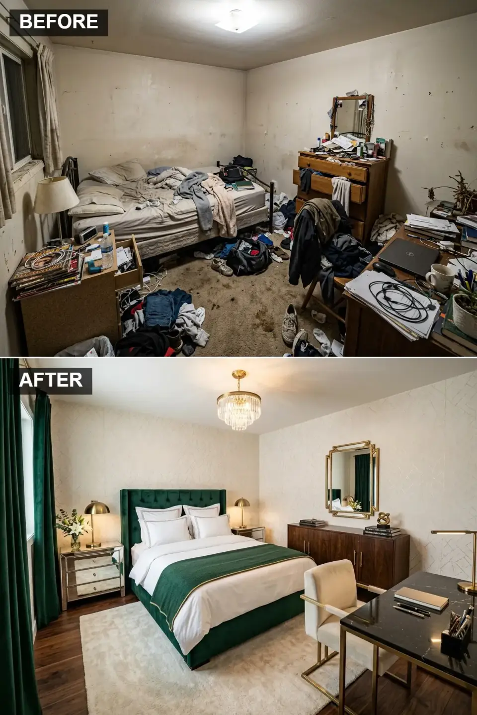
Emerald velvet and geometric wallpaper are a combination that can go either elegant or costume. The line between the two is usually hardware finish and ceiling treatment. Mirrored nightstands work, but they need to be real glass mirror on a solid frame — not mirrored MDF, which yellows at the edges within a year and can't be refaced. Brass lamps should be aged, never lacquered-new; the factory finish reads as a stage prop. A Charleston client of mine built this scheme in a 1920s historic-district primary bedroom last year, and the room now operates as her favorite reading retreat. What made it work: she kept the wallpaper to a single wall, not all four, which is the version most Pinterest boards mis-teach.
Color Palette
Emerald Green
#005C3F
A true jewel-tone; avoid any emerald that reads blue — it tips costume fast.
Cream & Gold Geometric
#FDF7EB
One accent wall only. Four walls of geometric wallpaper is a rare win.
Mirrored Glass
#EAEAEA
Real mirror on a solid frame — mirrored MDF yellows and can't be refaced.
Dark Walnut
#5C4033
Grounds the jewel-tone bed with a classic hardwood anchor.
Styling Notes for This Look
- Match wallpaper pattern scale to room size — small geometric on a small wall, large geometric only if the wall is over 12 feet wide.
- Use velvet on one major piece and nowhere else. Velvet on the bed plus velvet curtains plus velvet pillows reads as a showroom.
- Aged brass hardware, never polished. Polished brass ages into exactly the wrong tone for Art Deco.
Rugged Industrial Loft
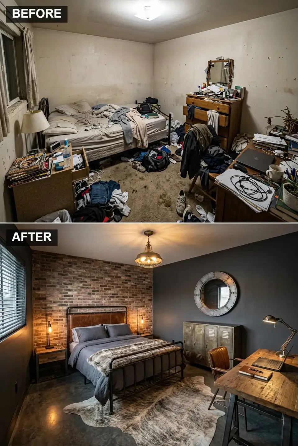
Industrial in a bedroom requires a level of acoustic mitigation most clients don't anticipate when they approve the renderings. Exposed brick, metal furniture, and concrete flooring all reflect sound hard — the room reads as echoey in conversation, and sleep quality drops measurably because the noise floor climbs. The fix is textile density: heavy lined curtains on at least two walls, a thick wool rug that covers 80% of the visible floor, and an upholstered headboard to break up the metal frame. Without those, the aesthetic wins and the sleep loses, and within a year the client is back on my calendar asking what went wrong. One other note: authentic exposed brick in a bedroom collects dust like a magnet. Brick veneer is the better call, even though the purists will argue otherwise.
Color Palette
Exposed Brick
#8C5E46
Brick veneer, not real exposed brick — the maintenance difference is substantial.
Charcoal Grey
#3F4144
Flat or eggshell finish; gloss kills the moodiness.
Aged Metal
#6D6D6D
Powder-coated steel, not raw iron — raw iron rusts in humid climates.
Concrete Grey
#999999
Polished concrete or a concrete-look LVT; avoid tile, which runs cold underfoot.
Styling Notes for This Look
- Budget heavily for textile absorption — at least 60% of walls and floor should be covered in soft material.
- Use brick veneer only. Authentic exposed brick in a bedroom collects dust and is almost impossible to clean.
- Keep metal furniture to two pieces maximum. A third tips the room from industrial into institutional.
Vibrant Mid-Century Modern
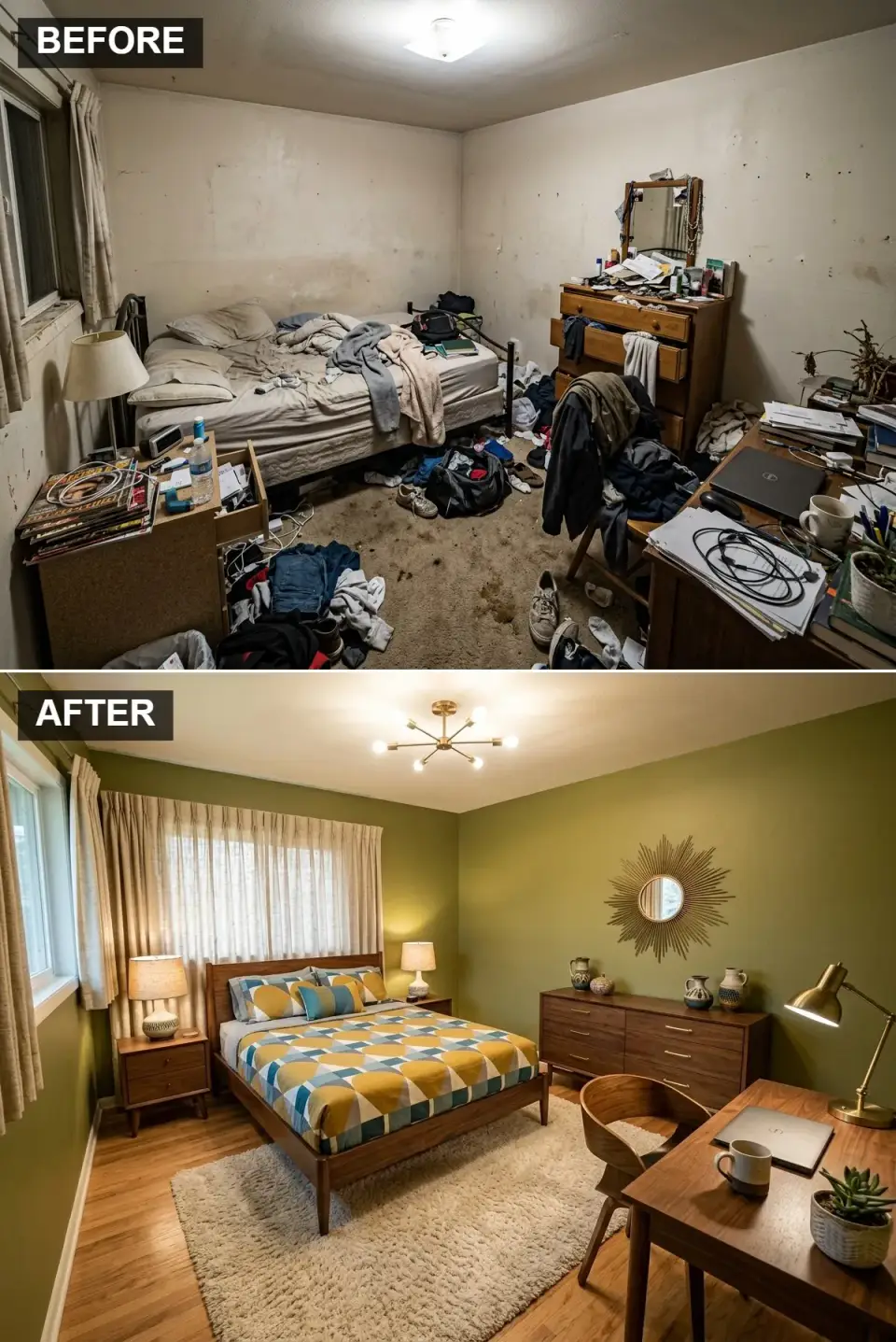
Mid-Century Modern is the most forgiving of the eleven styles on this list — it photographs well, ages well, and the secondary market for authentic walnut case goods has matured to the point that real vintage pieces are available at prices competitive with reproductions. The olive wall color is a confident call; it reads warmer than you'd expect under 3000K task lighting and cools down handsomely at night. The sputnik chandelier and sunburst mirror are the two MCM signals you either include or skip entirely. Half-hearted MCM — walnut furniture with a generic drum shade overhead — is the worst version of it, because it reads as generic mid-2010s Pinterest rather than as a specific design era.
Color Palette
Olive Green
#808C5A
A warm, earthy olive; avoid anything that tips army or avocado.
Classic Walnut
#7A573C
Solid walnut with tapered legs — the defining MCM silhouette.
Mustard & Teal
#D9A621
Bold pattern colors in bedding and throw pillows; the rest stays quiet.
Aged Brass
#C7A15B
For the sputnik fixture and sunburst frame; brass only, never chrome.
Styling Notes for This Look
- Source one authentic vintage piece — a dresser or nightstand — from an estate sale, not a reproduction retailer. The patina matters.
- Olive walls take slightly cooler lamps; use 3000K for task lighting, not 2700K, to stop the green from muddying.
- The sputnik chandelier is non-optional. Skipping it is skipping the era.
Cozy Boho Maximalist
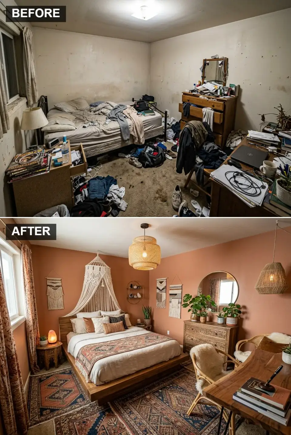
Maximalism is an art form, not a permission slip. The Boho version here — terracotta walls, layered patterned rugs, macrame, abundant visible plants — reads as cluttered within a year if the patterns aren't deliberately related to each other. The working principle I give every client who's drawn to this style: pick two accent colors before you buy a single textile, and make sure every pillow, throw, and rug contains at least one of them. Without that binding logic, the room reads as a thrift-store explosion rather than a curated collection. The plant count is the other common trap. Three well-chosen specimens at different heights carry more visual weight than twelve small pots on every surface, and they're significantly easier to keep alive.
Color Palette
Terracotta
#C17A5B
Warm earthy pigment; test against your Southern light before committing all four walls.
Natural Macrame
#EBE3D3
Undyed cotton cord; adds softness and intricate texture behind the bed.
/Accents Rust & Indigo
#9C4831
Rich repeat colors from layered rugs and pillows; limit to two accent tones total.
Carved Wood
#8B5A2B
Global character; one piece only, or the room tips from collected into crowded.
Styling Notes for This Look
- Pick two shared accent colors before you buy any textile. Every pillow, throw, and rug must contain at least one.
- Plant count: start with three large specimens at staggered heights, not twelve small ones. Scale carries more weight than quantity.
- Layer rugs deliberately — a small patterned rug on top of a larger neutral jute, not two patterns competing on the same plane.
Opulent Vintage Hollywood Glam
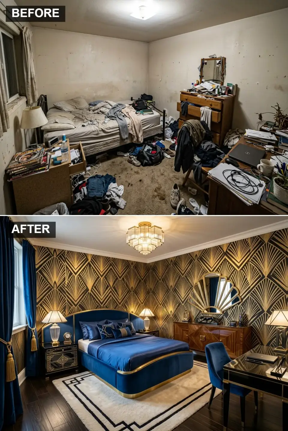
This is the most client-specific of the eleven. Hollywood Glam works in a primary bedroom of a 1920s Italianate, a lightly updated historic rowhouse, or a new-build with deliberately tall ceilings — and it looks ridiculous in a standard eight-foot builder-grade room, regardless of how beautifully the wallpaper is applied. The sapphire velvet bed, the Art Deco wallpaper, the crystal chandelier are each individually a full commitment; together they require a room that earns the drama. I'd estimate that one client in eight has a room that fits this style without forcing it. If your ceiling is under nine feet, the crystal chandelier will hang into the sightline and the scheme collapses. The honest recommendation is usually to pick one or two of these moves, not all four.
Color Palette
Fabric Sapphire Navy Velvet
#0F2C63
Real velvet on bed and curtains; polyester velour pills within six months.
Pattern Metallic Gold
#D4AF37
Opulent shine, geometric pattern — reserve for one wall, not four.
Finish High-Gloss Black/Wood
#1A1A1A
Gloss lacquer on solid hardwood; veneer gloss chips within a year of use.
Crystal
#E6E6E6
Anchor to a structural beam, not just drywall — crystal fixtures exceed ceiling-box ratings.
Styling Notes for This Look
- Minimum 10-foot ceilings, minimum 14-foot walls. Below that, the drama collapses.
- Real velvet on the bed and curtains — never polyester velour, which pills on any high-touch surface within half a year.
- Anchor the crystal chandelier to a structural beam, not a standard ceiling box. Crystal fixtures routinely exceed the box weight rating.
Pro Tips From Seven Years of Client Bedrooms
- Pick your palette from fabric, not paint chips. Paint samples under store fluorescents don't predict how they'll read at home. Bring a bedding sample or a throw pillow home first, pin the paint chip next to it for 24 hours, and decide then.
- Layer your lighting in three levels. Never rely on a single overhead fixture. Every bedroom needs ambient (ceiling), task (bedside), and accent (floor lamp or sconce). The overhead alone produces a room that feels institutional after dark.
- Measure twice for the rug. The bed-plus-two-feet rule is non-negotiable: your rug should extend at least 24 inches beyond the bed on the two sides you walk around. A rug that disappears under the bed and stops flush with the frame reads as an afterthought.
- Don't furniture-match a bedroom. Matched case goods — dresser, nightstands, bench, all in the same finish from the same line — read as showroom stock. Mismatched pieces in related tones read as collected.
- Budget one statement piece and edit everything else. The bed, or the wallpaper, or the rug — one of those three gets to be the room's headline. Letting all three compete produces visual noise.
Frequently Asked Questions
Which of the eleven styles is most forgiving of imperfect execution?
Mid-Century Modern, without much competition. The secondary market for authentic walnut case goods has matured, the silhouettes are recognisable even in rough condition, and the sputnik-plus-sunburst shorthand is hard to get wrong once you've committed to it. The least forgiving is Hollywood Glam — it requires ceiling height, real velvet, and structural attention, and half-measures collapse it into costume.
What's the single most common mistake I see across all eleven styles?
Bulb temperature mismatch. A room painted charcoal with 4000K bulbs reads as a morgue. A farmhouse in 2700K reads as warm; the same room in 5000K LED reads as a garage. Every palette above is drawn against an assumed warm-light envelope. Change the bulbs before you repaint.
How do I pick which style fits me, honestly?
Walk through your existing home and notice which three rooms you're drawn to at the end of a long day — not which rooms look best in photos. The textures, colors, and lighting temperatures of those three rooms are your real preferences. The style on this list that maps closest to that triangulation is the one to build.
Is any of these styles better for small bedrooms?
Japandi and Sleek Modern Minimalism are the two that handle small square footage best, because both reduce visual weight deliberately. Moody Glamour also works in small rooms if the envelope is fully committed (walls plus ceiling). The styles that struggle in small rooms are Hollywood Glam (needs ceiling height), Industrial (needs acoustic volume), and Boho Maximalist (needs surface area for the pattern layering to read right).
How much should a full bedroom makeover cost in the Southeast?
Rough 2024–2026 ranges I've seen in the Carolinas and Georgia: $4,000–$7,000 for a DIY-with-paint execution on any of these styles, $8,000–$14,000 for a stylist-led build with real furniture and proper lighting, and $16,000–$28,000 for the Hollywood Glam or Art Deco versions where the wallpaper, real velvet, and crystal fixture each carry real cost. The most expensive part is almost always the lighting, not the furniture.
Can I mix two of these styles?
Yes, and most lived-in bedrooms eventually do. The working pairs: Japandi plus Organic Modern (share the same restraint and natural materials), Scandi-Boho plus Mid-Century Modern (share the warm-wood base), and Moody Glamour plus Art Deco (share the dark-jewel vocabulary). The pairs that fight: Industrial plus anything soft, and Hollywood Glam with anything rustic.
Which of these styles ages best over five to ten years?
Rustic Farmhouse (if executed with real materials, not vinyl shiplap), Mid-Century Modern, and Organic Modern all age well because they're rooted in real material behaviour — wood patina, limewash oxidation, wool softening. The styles that age worst are Industrial (dust accumulates, metal pits) and Boho Maximalist (patterned textiles date fast). Hollywood Glam holds if the envelope is high-quality; cheap velvet and foil wallpaper collapse by year three.
Sources & Further Reading
- Cooper Marcus, C. (1995). House as a Mirror of Self: Exploring the Deeper Meaning of Home. Conari Press.
- American Society of Interior Designers (ASID), Outlook and State of Interior Design annual reports — 2023 and 2024 editions on bedroom design priorities and client spending.
- U.S. Department of Energy, Building Technologies Office — Residential Lighting Guidance, on color temperature and circadian considerations for bedroom spaces.
- Figueiro, M. G., & Rea, M. S. — publications of the Lighting Research Center (Rensselaer / Mount Sinai) on circadian-supportive home lighting.
- Illuminating Engineering Society (IES), Lighting Handbook, 10th Edition — reference standards for layered residential lighting.
- Author's consultation notes, Charleston / Mount Pleasant / Summerville / Kiawah / Savannah / Asheville bedroom projects, 2019–2026.
Final Thoughts
Eleven directions from one builder-grade starting point, and the honest takeaway is the same as the one I give every new client: pick the style your nervous system actually relaxes in, not the one your Pinterest board has been building for five years. The two are rarely identical. The room that photographs best on the day the contractor packs up isn't always the room you want to wake up in at 6:47 on a Tuesday in February.
If any of these directions pulled at you, the companion pieces on this site extend the argument in practical directions. The cluttered-to-calm arc at the center of several of these transformations is treated section by section in the ultimate room reveal — eleven transformations from a cluttered mess, which follows the same editing logic through different room types. The Scandi-Boho and Japandi lines in this piece are developed further in the Nordic glow-up Scandi sanctuary walkthrough, which is specifically about what it feels like to live with the pale palette over a year. The spare-room version of this same portfolio — eleven takes on a different starting room — is the spare-room sanctuary piece, worth reading side-by-side with this one if you're styling more than one bedroom. And for readers interested in the format itself — one room, many directions — the one-room, ten-transformation guide is the closest cousin on the site.
Look at the room you already have. Notice which of the eleven you'd actually come home to. Start there.
— Johan Martez, Charleston, SC

Elise Marchetti
Transformations Editor · Charleston, South CarolinaBefore-and-after projects with the invoices attached. Elise runs the Transformations desk — interiors, exterior facades and outdoor spaces across the Lowcountry and the wider South — and writes up what actually changed, what it cost, and which three decisions moved the room.
More from Elise →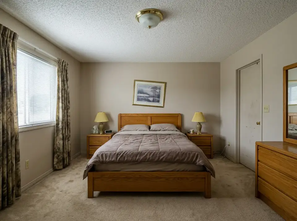
Reader notes